


Barhop Buddy
Overview
A travel and review app designed to guide newcomers through Philadelphia's vibrant nightlife & downtown entertainment.
Role
UI/UX Designer
Brand Designer
Timeframe
12 weeks
Tools
Figma
Illustrator
Google Forms
Problem Statement
People exploring city nightlife lack a simple, reliable way to discover spaces with clear, transparent insights into sensory environments, making it difficult to choose spaces that match their preferences and comfort.
Competitor Research
I began my research by searching for one direct and one indirect competitor. I decided on Trip Advisor for it's similarity in being a travel and review app, and on Rotten Tomatoes for it's relevant rating system.
SWOT Analysis
My insights and findings were summarized into a SWOT Analysis, where I discovered their shared strength of bringing in daily active users, but opposite pain points of having too much or not enough data to concisely highlight health trends.
User Interviews
Surveyors were given the option to participate in a 5-10 minute interview at the end of the research survey. In these interviews, they were asked about their preferences in more detail.
"I really struggle finding fun places to go on regular travel apps, all the filters are so generic. I would love if there were a lot of specific filter categories so I could really find somewhere that suits me!"
"I use the bus or walk to get around in Philly. I think having some kind of map that showed the distance from each bar would be helpful for bar hopping around at night safely."
"I've always wanted to explore Philly's bars, but I get easily overwhelmed by all the people and noise. I wish I could go to bars when they're at their emptiest, but I never know when that is, and most travel apps don't have much detail on the crowds…"
Filters Give Control
Navigation Through Map
Users want to be able to access clear information on the crowds and noise levels of bars. This transparency will encourage users to explore more through the app and become less overwhelmed.
User Statement
“I’d like an experience that helps me learn about and find bars that fit my wants for a fun 21st birthday celebration!”
Pain Points
Struggling to narrow down her options
Wants to find a younger crowd
End Goal
Be able to find an exciting downtown bar with other college students.

29 years old, Operations Analyst, She/Her
User Statement
“I’d like an experience that provides a personalized itinerary to help me explore Philadelphia's nightlife for the first time.”
Pain Points
Visiting from New York
Doesn't like loud music or tight spots
End Goal
Find at least 4 bars to check out during his trip that cater to his needs.
Information Architecture
Feature Flows
Directly Searching For a Bar and Saving to a Collection
Nayah Haynes, "Nightlife Newcomer"
This flow addresses Nayah's pain point of narrowing her options by designing a careful filter-based searching system and collection saving feature so that she can organize all the bars that match her preferences.
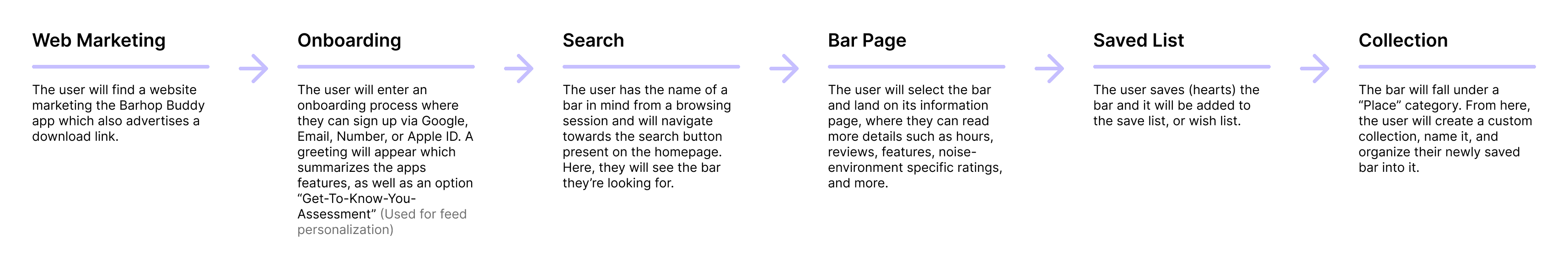
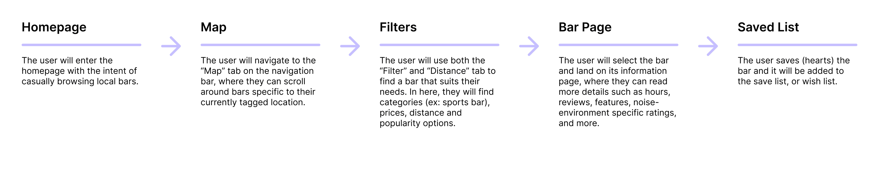
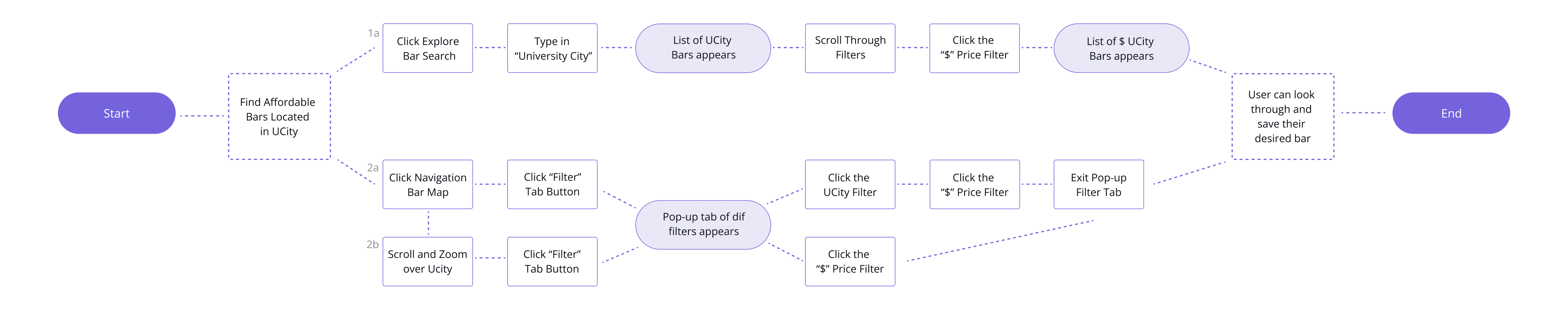
Searching For Bar With Map and Filters
Chris Parella, "Explorative Traveler"
This flow addresses Chris's pain point of visiting from outside of Philadelphia by dedicating a feature to an interactive, filtered map for clear and personalized navigation throughout the bars downtown.
Reviewing a Bar
Chris Parella, "Explorative Traveler"
This flow addresses Chris's pain point of wanting to find bars that fit his sensory needs by uniquely detailing the review feature, with categorized descriptors and detailed noise and crowd ratings.

User Flows
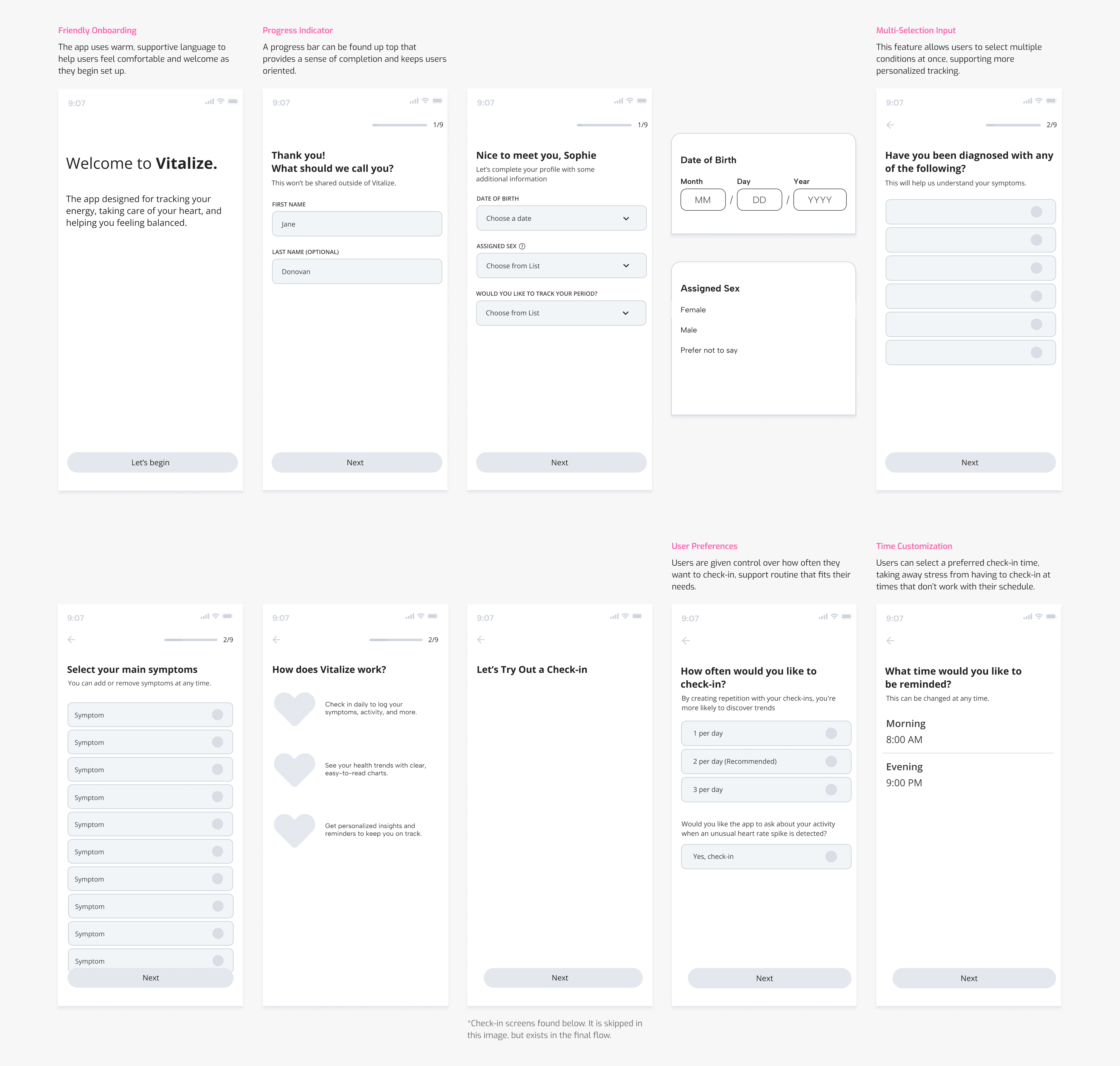
I made sure to design an experience that didn't leave users feeling endlessly overwhelmed and quick to drop off.
Developed intentional onboarding features that targeted both user persona's pain points.
Directly Searching For a Bar and Saving to a Collection
Nayah Haynes, "Nightlife Newcomer"
Searching For Bar With Map and Filters
Chris Parella, "Explorative Traveler"

Reviewing a Bar
Chris Parella, "Explorative Traveler"

Visual Design
Usability Testing
I conducted 1 round of usability testing with 8 testers. Each user went through medium-fidelity journeys designed to be based off the flow charts above. All 8/8 users were able to successfully search for bars (directly, through a map, and with filters), save a bar to a personal collection, and rate and review a bar.
However, changes were made in each flow to give more clarity to the users when filtering and locating bars.
*Images in progress
Saving to a Collection: Streamlining Navigation
Problem: Cluttered Saved Page
Users struggled to navigate the original “Wishlist” page due to its horizontal scroll and lack of filtering options. As more bars were saved, the interface became cluttered, requiring too much scrolling to locate specific items.
Solution: Streamlined Navigation and Filter
The page was redesigned as “Saved,” with a vertical scroll layout for easier browsing. A filter button was introduced to streamline navigation, and a “Create Collection” feature was added to help users organize saved items into themed lists or custom itineraries.
*De-cluttering the save page targeted Nayah's pain point of struggling to narrow down options.
Navigation: Improving Informational Hierarchy
Problem: Unclear Hierarchy
Users had difficulty navigating when key information was placed inside the container rather than below it.
Users responded more quickly when the information was positioned beneath the page buttons and images.
Solution: Improved Visual Layout
Necessary information was put below every bar page, highlighting every bar’s name, highlighted tags, price range, type of bar, rating between 1-5 stars, and closing hour.
This change allowed users to quickly be able to select bars based on their preference, without having to click in and out of multiple pages to find necessary information.
*Making information more easily accessible targeted Nayah's pain point of feeling overwhelmed by data.
Browsing: Clearer Information
Problem: Confusing Data Display
Users struggled to read the crowd and noise scale when it was presented as a meter. They also struggled to rate on this scale during the review flow, commenting that it did not feel clear or specific enough.
Solution: Improved Data Visualization
Designing a more clear 1-10, gradient bar allowed for users to read the crowd and noise environment more easily, as well as rate it themselves.
*Redesigning the crowd/noise scale to be more readable targeted Chris' pain point of seeing info on sensory experiences.
Final Designs
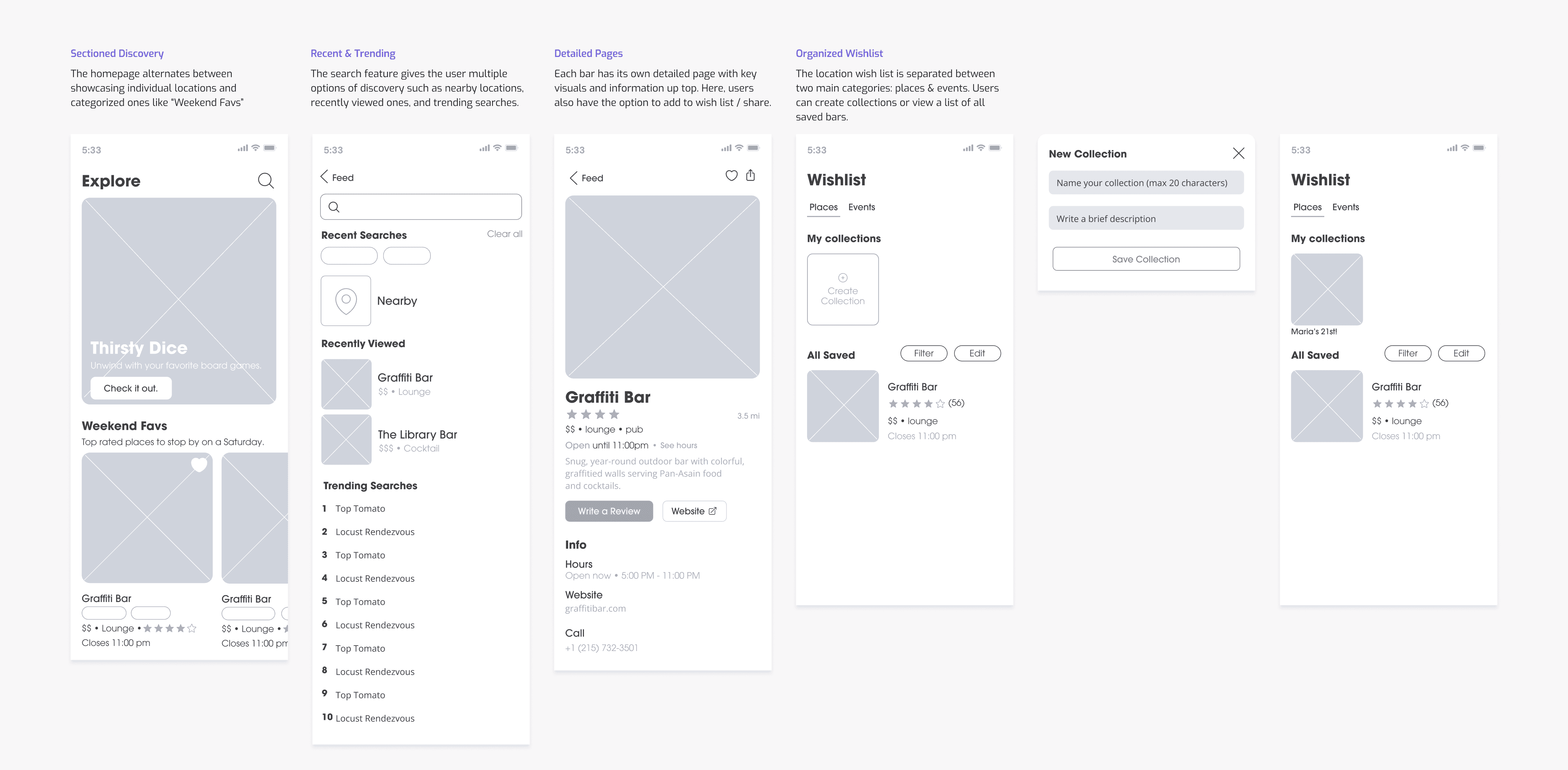
Accessible & Personalized Browsing
The homepage consists of categorized bars that cater to user preferences.
Each bar/venue has easily accessible info on their price point, category, user-generated descriptors, rating, and closing hours.
Users can quickly save any bars that catch their attention without leaving the page.


Curated Saving
For quick planning, users can create custom collections and save places to them.
Suggestions are generated based on what the user has added / looked at previously.
Unique Review Experience
On top of anticipated ratings and written responses, users are also asked for crowd/noise ratings & descriptors.
These questions strengthen the app's database and build trust for new users.


Key Takeaways
Communication with Testers
Interviewing and user testing takeaways were beneficial in each stage of the process. Due to the specific target audience and range on the introversion spectrum, this consistent communication provided insight into every possible outlook and experience and helped shape the app’s design.
Research and Competitors
Designing a prototype for a navigation-centered app required detailed research on locations around the city and their available information. Spending extensive time on travel app analyses and businesses downtown made prototyping and designing map-based features smoother.
Gamification
The project began with a goal to include a gamified feature to build an audience, and while the initial direction of a more literal game changed, the decision to design an achievement system attached to the mascot and bunny branding became a fun way to make the app more interactive and stand out from its competitors.
Reflection
This project underwent various design changes and involved thorough research and user testing to reach its full potential. It showcases my aim to demonstrate high-level experiences and visions for an app.
Given more time, I would like to flesh out the events feature of the app. How could the app update current events on a daily or weekly basis? Who would they have to partner with to achieve this?