
Barhop Buddy
2024
A travel and review app designed to guide newcomers through Philadelphia's vibrant nightlife.
Type of Project
Personal Project
Role
UI/UX Designer, Branding
Project Duration
12 weeks
01. Discover & Define
Initial Thinking
Target Users
01. Inroverts looking to work their way into the bar scene
02. Travelers unfamiliar with Philadelphia nightlife
Research Methods
01. Existing Systems
02. Quantitative research (survey)
03. Qualitative research (user testing)
Requirements
Product
○ This app is for exploring Philadelphia’s nightlife and leaving reviews.
○ Users can explore areas based on location, leave detailed reviews on crowds and noise, and create custom collections.
User
○ Primary User: A person interested in city bars and venues between the ages of 21-35.
○ Satisfying travel information, reviews, and itinerary creation.
Technical
○ Designed for mobile app usage across multiple screen sizes.
Business
○ Competitors: Trip Advisor, Rotten Tomatoes
○ To stand out, Barhop Buddy asks for reviews on crowds and noises in locations. The app also contains a fun, engaging bunny mascot.
Competitive Analysis
Trip Advisor and Rotten Tomatoes were carefully analyzed for their well-known review features.
Strengths
Brand Recognition
User-Generated Content
Diverse Offerings
01.
Trip Advisor
Weaknesses
Dependence on User-Generated Content
Overwhelming UI
Opportunities
Mobile Experience
New Travel Services
Feed Personalization
Threats
Economic Changes
Global Events
Bots and Fake Reviews
02.
Rotten Tomatoes
Strengths
Brand Recognition
Large Database
Screen Accessibility
Weaknesses
Strong Bias
Influx of Negative Reviews
Spam Content
Opportunities
Content Generation
Feed Personalization
Threats
Changes in Media
Regulatory Issues
Generative research and surveys revealed that travel and planning apps are often broad and overwhelming, failing to meet specific needs. Young surveyors, particularly introverts, shared feeling intimidated by Philadelphia's nightlife. Designing an app focused on nightlife, with transparent details like audience, crowd size, and volume levels, creates a welcoming and stress-free experience for nightlife exploration.
100%
Bars, Events, & More
All survey participants supported the idea of expanding the app beyond traditional bars. They expressed interest in including nighttime venues and activities featuring a bar. Additional comments were left, noting how this would make for a less intimidating experience.
85%
Filters Please!
Eighty-five percent of survey participants expressed a strong desire for a detailed filtration and categorization system.
User Personas
The primary users, young adult introverts, are eager to explore city life but feel overwhelmed by the excessive information on travel guide apps.
I developed two user personas— one female and one male — each representing different spectrums of introversion, location, age within the young adult range, and primary goals.
Persona 1
Nayah Haynes
20 years old
Undergraduate Student
Friendly, Creative

Aspiration
“I’d like an experience that helps me learn about and find bars that fit my wants for a fun 21st birthday celebration!”
User Environment
Spends a lot of time on her phone, often using social media
Uses tech for school and work
Pain Points
No knowledge of bars or drinks
Wants to find somewhere with a younger crowd
Attitude
“It doesn’t hurt to try!” mindset
Enjoys meeting new people, but has a limited social battery
End Goal
Be able to find an exciting downtown bar with other college students
Persona 2
Chris Parella
29 years old
Operations Analyst
Reserved, Critical

Aspiration
“I’d like an experience that provides a personalized itinerary to help me explore Philadelphia's nightlife for the first time this week."
User Environment
Spends a lot of time on his phone and at his desk
Plays online games with his friends after work
Pain Points
Visiting from New York
Doesn’t like loud music or tight spots
Attitude
Doesn’t like going out by himself
Seeks connections in his field
End Goal
Find at least 4 bars to check out
during his trip that cater to his needs
User Flows
Detailed user flows were created to show the process of completing a search, save, and review task from both a user who found a website advertising the app and a user who already has an account with Barhop.
Nayah Haynes
Searching for and saving a bar to a collection.
Chris Parella
Reviewing a recently visited bar.
Low-Fidelity Wireframes

Nayah Haynes: Saving a Bar

Chris Parella: Reviewing a Bar
User Testing Insights
Layout Approach
Users preferred smaller images with information and tags displayed below them, rather than within the images.
Wishlist vs Saved
Users favored a text-centered over image-centered collection, as well as for the title to be changed from “Wishlist” to “Saved”
Filters and Tags
Users enjoyed organized filters and tags when navigating the app
01.
02.
03.
03. Branding & UI Design
Branding

Logo
The lowercase "b," shaped like a rabbit, merges the word "bar" with the brand's bunny mascot, using a playful serif font to convey a sense of charm and approachability that aligns with the brand's identity.

Color & Typography
Designed to resemble the night sky, the color palette features cool-toned shades of black, gray, and purple. The clean and geometric sans typeface, ITC Avant Garde Gothic, enhances the apps readability and reflects its modern approach.
UI Design
Visual Accessibility
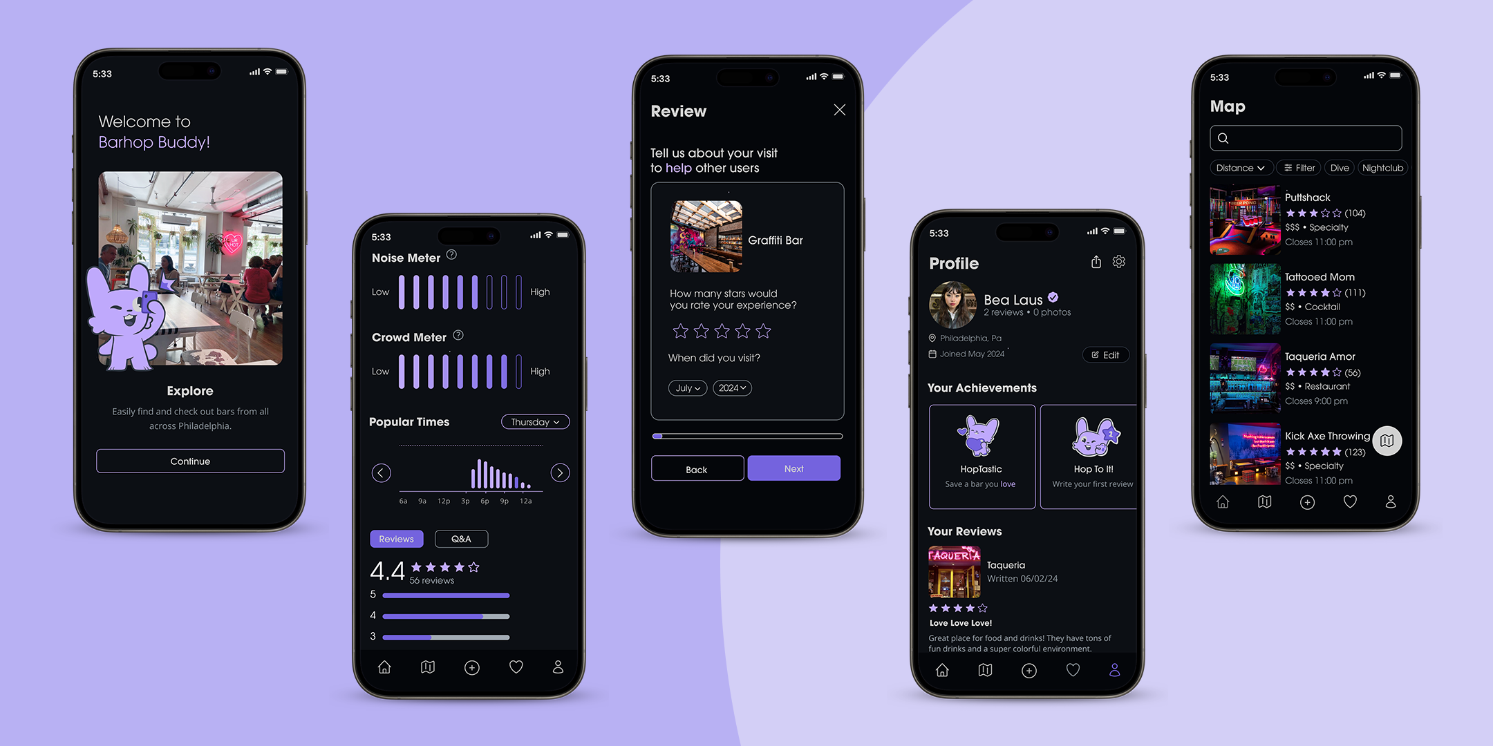
Barhop Buddy’s dark mode aesthetic is not only visually appealing but also designed to suit the nightlife context, reducing eye strain in low-light environments. Vibrant purple accents are used for interactive elements like buttons and highlights, guiding user attention.
Rounded edges and clean typography enhance the overall approachability of the interface. The addition of a playful bunny mascot creates an engaging and friendly tone, helping introverted users feel more comfortable navigating the app.


Reaching the Target Audience
Barhop Buddy is built to address the needs of young adults possibly new to city nightlife. The “Noise Meter” and “Crowd Meter” provide clear, visual indicators of bar ambiance, assisting users in saving bars that best match their comfort level.
The app’s map and search tool integrate detailed filtering options specific to personal experience, with each bar having custom tags and key features. Gamified features, such as the achievements found on users’ profiles, encourage user engagement, making the app feel rewarding and personalized.


Final Prototype
04. Reflection
Project Takeaways
Communication with Testers
Interviewing and user testing takeaways were beneficial in each stage of the process. Due to the specific target audience and range on the introversion spectrum, this consistent communication provided insight into every possible outlook and experience and helped shape the app’s design.
Research and Competitors
Designing a prototype for a navigation-centered app required detailed research on locations around the city and their available information. Spending extensive time on travel app analyses and businesses downtown made prototyping and designing map-based features smoother.
Gamification Goal
The project began with a goal to include a gamified feature to build an audience, and while the initial direction of a more literal game changed, the decision to design an achievement system attached to the mascot and bunny branding became a fun way to make the app more interactive and stand out from its competitors.

This project underwent various design changes and involved thorough research and user testing to reach its full potential. It showcases my aim to demonstrate high-level experiences and visions for an app.
Given more time, I would like to flesh out the events feature of the app. How could the app update current events on a daily or weekly basis? Who would they have to partner with to achieve this?