
An art museum website that houses contemporary art and brings attention to local, young, and upcoming artists.
C:ontempo

Role
UX/UI, Web Designer
Project Duration
8 weeks
01. Discover & Define
Initial Thinking
Target Users
Artists looking to find inspiration
Young artists seeking a community
People interested in contemporary art
Research Methods
Qualitative research (user testing)
Quantitative research (survey)
Existing Systems
Competitive Analysis
Institute of Contemporary Art
Strengths
Innovative Exhibitions
Community Engagement
Educational Programs
Weaknesses
Funding Dependent
Limited Collection
Opportunities
Expanded Exhibitions
Increased Collaboration
Informational Tools
Threats
Economic downturns
Competition
Barnes Foundation
Strengths
Unique Display
Educational Mission
Community Events
Weaknesses
Limited Focus
Funding Dependence
Controversies
Opportunities
New Partnerships
Updated Experiences
Threats
Digital Age
Economic Downturns
Requirements
Product
This website is the host for a contemporary museum.
Users can view the museum’s collection, read visiting information, visit the shop, book tickets for exhibits/events, and submit their own work.
User
Primary User: A person interested in art, between the ages of 15-29.
Satisfying database browsing, online booking, accessing information, and submitting.
Technical
Compatible across multiple screen sizes.
Young Artist Submissions can only be submitted on a PC, not on a tablet or mobile.
Business
Competitors: ICA, Barnes, AIC
To stand out, C:ONTEMPO creates a more community-driven experience
The museum and website are advertised through social media and outdoor posters.
User Data
45%
Exhibitions and Events
When asked “What is your primary reason for visiting a museum’s website?”, 45 percent of survey participants selected “To learn about upcoming exhibitions and events.” 25 percent selected “To explore the museum’s collection” These survey responses led to the app’s main two user personas and journeys.
60%
Frustration with Navigation
When asked “What current challenges or frustrations have you faced when using a museum website?”, 60 percent of survey participants selected “Website is difficult to navigate / Hard to find information.” This information led to prioritizing the website’s information architecture and a user-friendly design process.
User Personas
28 years old | Freelance Illustrator | Detail-oriented, Organized
Persona 1: Gabriel Malabuyo

User Statement: “I’d like an experience that provides details and well-organized information on exhibitions before I make my purchase.”
Pain Points
Overanalyzes information
Wants to know every detail possible
End Goal
Browse Featured / Current Exhibitions
Purchase an exhibition ticket
19 years old | 2D Animator | Extroverted, Community-Driven
Persona 2: Katie Purcell

User Statement: “As a recent high-school graduate and aspiring animator, I want to find communities where artists can meet and showcase their work.”
Pain Points
Feels lonely post-grad
Struggles to find new opportunities
End Goal
Submit a video for a 2D Animation temporary gallery and film-screening
User Flows
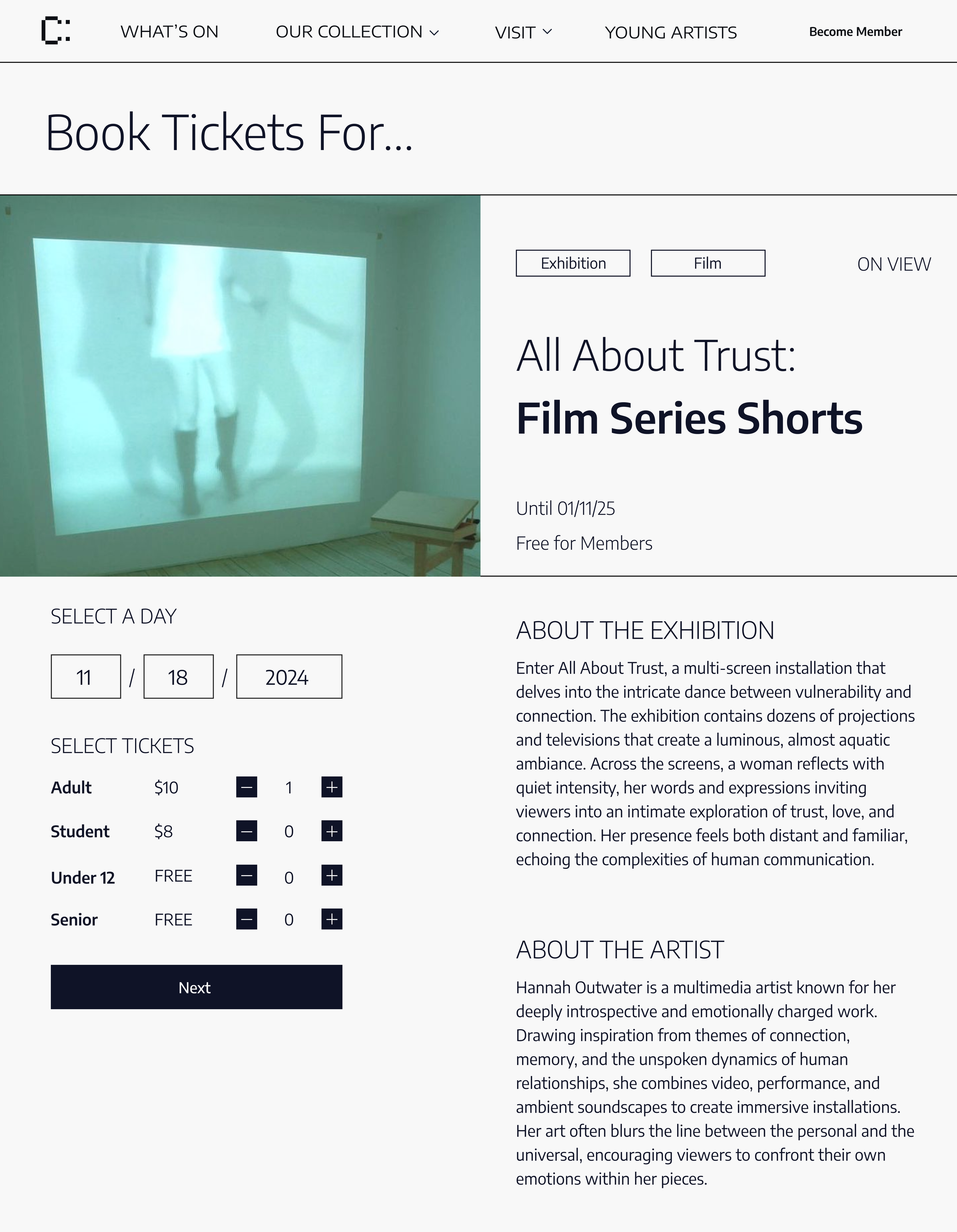
Flow 01. Purchasing a ticket for an exhibition
Flow 02. Submitting Work to the Young Artist Gallery
02. Explore & Ideate
Prototyping and Testing
Beginning with card sorting, paper testing, and low-fidelity screens, I received feedback on the first stages of my website.
Low and med fid journeys were designed for initial user testing and feedback.
Journey 01. Purchasing a ticket for an exhibition
Notes: With the majority of survey respondents reporting difficulty navigating museum websites to find exhibitions and purchase tickets, my primary goal was to design an experience that led to clear and quick transactions. Before designing low-fidelity screens, I conducted in-depth research on competing museum websites, analyzing how they presented exhibition descriptions, placed call-to-action buttons, and guided users through the purchasing process.
I discovered that 1. exhibitions increase engagement when featured under a dedicated tab, 2. users are more engaged when key information is immediately visible on a page, and 3. condensed purchasing steps lead to longer site interaction and higher conversion rates.
Journey 02. Submitting work to the Young Artist Gallery
Notes: After establishing a purchasing and collection navigation system, the secondary goal for C:ONTEMPO was to design an experience that could successfully market their location to local artist communities. While several competitor museums offered competitions or temporary spaces for artists, these opportunities were infrequent and lacked a dedicated space on their websites. They were never attached directly to the brand.
Through prior interviews, I found that 80% of artists were unaware that museums even hosted such events. Initially, I added a “Submit Work” button to the navigation bar to surface these opportunities; however, it was quickly discovered to be unclear. This raised a question of how to advertise community events and galleries in a familiar yet unique way.
User Testing
User tests were conducted for each prototype. I broke down each case into a summarized problem and solution.
Problem
Updated Verbiage
“What’s On” & “Our Collection” need to have clearer distinctions, particularly regarding the difference between student, temporary, and permanent exhibits & collections.
○ Memberships should be marketed on exhibition and booking screens.
Lexicon Issues
The user hesitates between “What’s On” and “Our Collection” before clicking “What’s On" and finding the exhibitions
The user quickly navigates through the purchasing process and lands on the end screen, noting some confusion about the membership option.
Solution
Introduced User-friendly Features
Introduced a calendar and time slot picker to create a more efficient booking process.
Expanded ticket categories to include senior, disability, and other visitor types, improving clarity and accessibility.

After
Inefficient Booking Flow
The booking process relied on manual entry for date and time selection, which led to confusion and slowed user progress.
The user quickly navigates through the purchasing process and lands on the end screen, noting some confusion about the membership option.
Before
Unclear Navigation
The user quickly selects “Submit Work”, but notes confusion about the wording and button placement. The user selects an open event but asks about where he can locate a description of the event duration and where he can locate past participants’ work.
Refined Labelling
Remove the “Submit Work” button and replace it with a “Young Artists” tab, similar to "Our Collection" and "What’s On." This will reduce confusion while highlighting both young artists' involvement and the promotion of a membership.
Expanded Filter System
Added new filters for category, artist, and theme to support more intentional collection searches.
Reorganized the filter layout to separate category and medium for clarity.

Limited Filtering Options
The user struggled to narrow down artworks effectively using only the basic search, medium, and year filters.
The lack of categories made browsing feel overwhelming and imprecise, especially for users with specific inquiries.

After
Before
03. Visual Identity
Visual Language
Notes: Contempo’s website features a structured grid layout with rectangular image containers, creating a clean and minimalist design that allows the artwork to remain the focal point without competing with a specific color palette or language.
04. Final Reflection
Project Takeaways
User-Centered Design
User research and feedback played an important role throughout the entire design process. Considering the diversity of potential museum visitors, three user personas with different ages, art-related goals, and levels of tech-savviness were created. The user testing process involved maintaining communication with testers ranging from 20 to 60 years old, ensuring a design that was intuitive, engaging, and tailored to meet the needs of all users.
Clear Information Architecture
Initial survey respondents expressed frustration with navigating the museum websites they currently use. Feedback revealed that users often struggle to find exhibit details, special opportunities, and specific artwork within collections. With these issues in mind, Contempo prioritizes a clear, well-organized layout, featuring creative, but straightforward categorization, ensuring users can easily access the information they search for most frequently.
Community Engagement
Contempo aims to deliver an experience unique from other local art museums. By including a “Young Artist” feature, the website not only gives users a chance to view artwork, but to include their own as well. This interactive element encourages community engagement and invites a wider audience of users.
Final Notes ⋆
This project focused on creating a design that provides a more flexible user environment while exploring a wider target audience. This design process showcased my ability to maintain consistent and productive communication with users, further developing my skills in ux design.
