WEBSITE REDESIGN
Overview
Role
UX Auditor
UX/UI Designer
Timeframe
3 weeks
Tools
Figma
Illustrator
Problem
Users, both casual and intentional, face multiple difficulties navigating UNIQLO’s website. The current design contains confusing navigation and filtering systems, slowing down the journey of easily locating or purchasing a product. The flows of these systems, paired with outdated architecture and poor visual & product discovery hierarchy, contribute to higher drop-off rates.
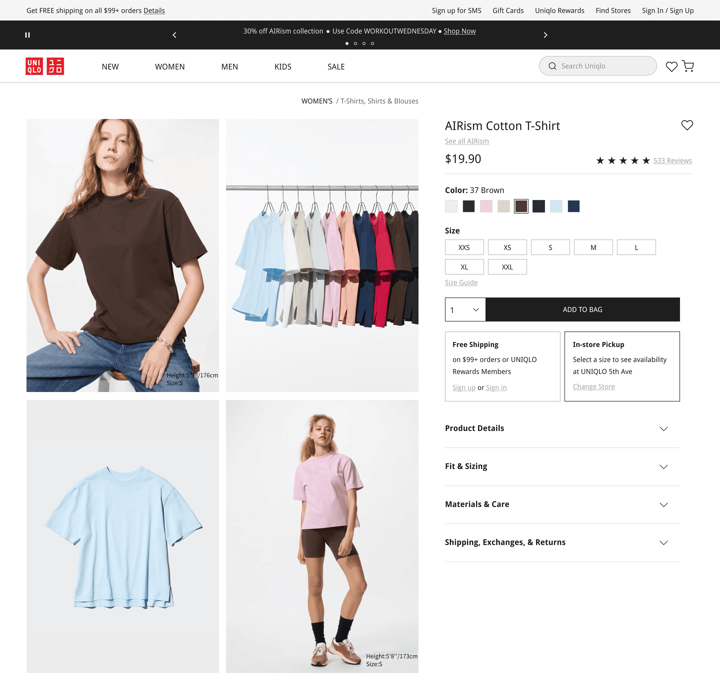
Select screens from final design
Discovery
Pain Points
Outdated Visuals & UI
Led to unclear buttons, making navigation confusing and leading to higher drop-off rates
Hindered specific product discovery, especially for new users
Unclear Navigation & Filtering
Overwhelming and lengthy navigation process when browsing
Unclear filtering language, limiting personal style discovery
Competitor Research
Following the best practices in e-commerce design, I identified competitors that displayed these qualities, matched areas of Uniqlo's target audience, and statistically showed strong site traffic and conversion performance.
I landed on 3 popular clothing brands: Urban Outfitters, Banana Republic, & J-Crew.

A lifestyle brand with clothing that caters to younger, trend-driven shoppers looking for both everyday wear and trendy pieces.
Target Audience:
18-28
Men & women; women leaning
Students / young adults
Mid-range price
Trendy, street, vintage style
Insights:
Strong visual product discovery
Large imagery & editorial-style layouts throughout site
Trend-based categorization
A modern, versatile clothing brand focused on essentials and work-to-weekend pieces.
Target Audience:
28-45
Men & women; balanced
Professionals
Mid-high price
Polished professional style
Insights:
Clear product hierarchy; classic & direct categories
Structured filtering system
Visual consistency
A clothing brand known for its classic styles and high-quality basics.
Target Audience:
25-45
Men & women; balanced
Style-conscious adults
Mid-high price
Classic preppy
Insights:
Large navigation menu
Use-case categories
Detailed product filtering for intentional discovery
Feature Audit
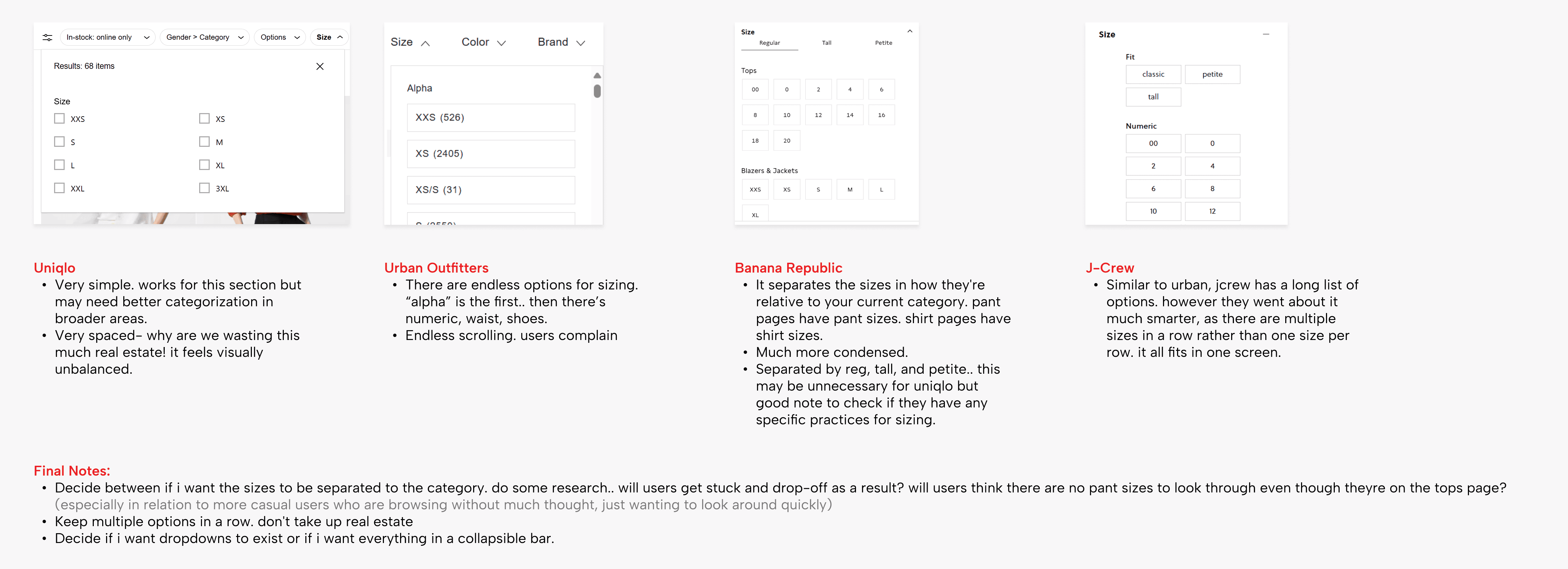
8 features in total were examined.
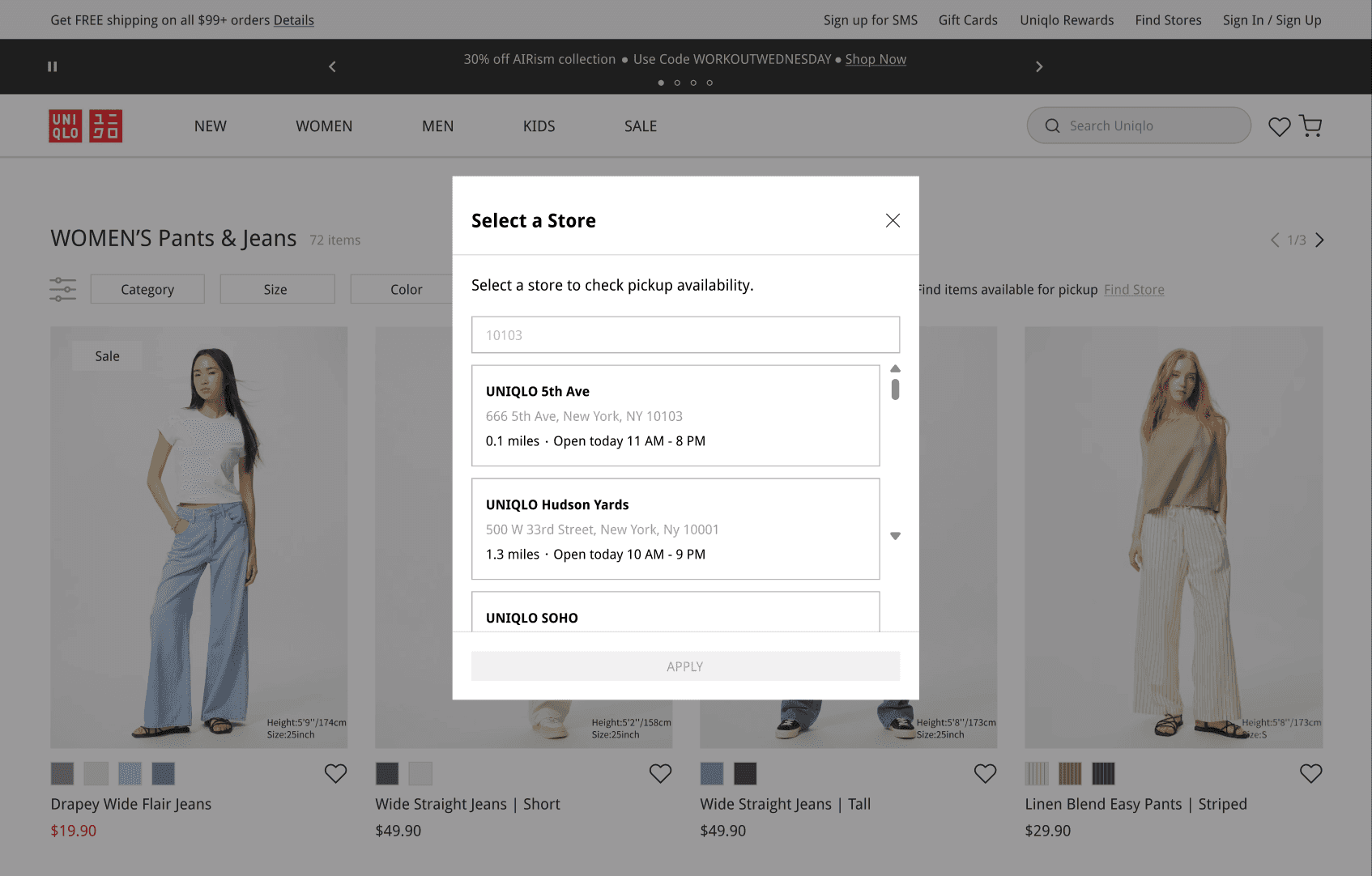
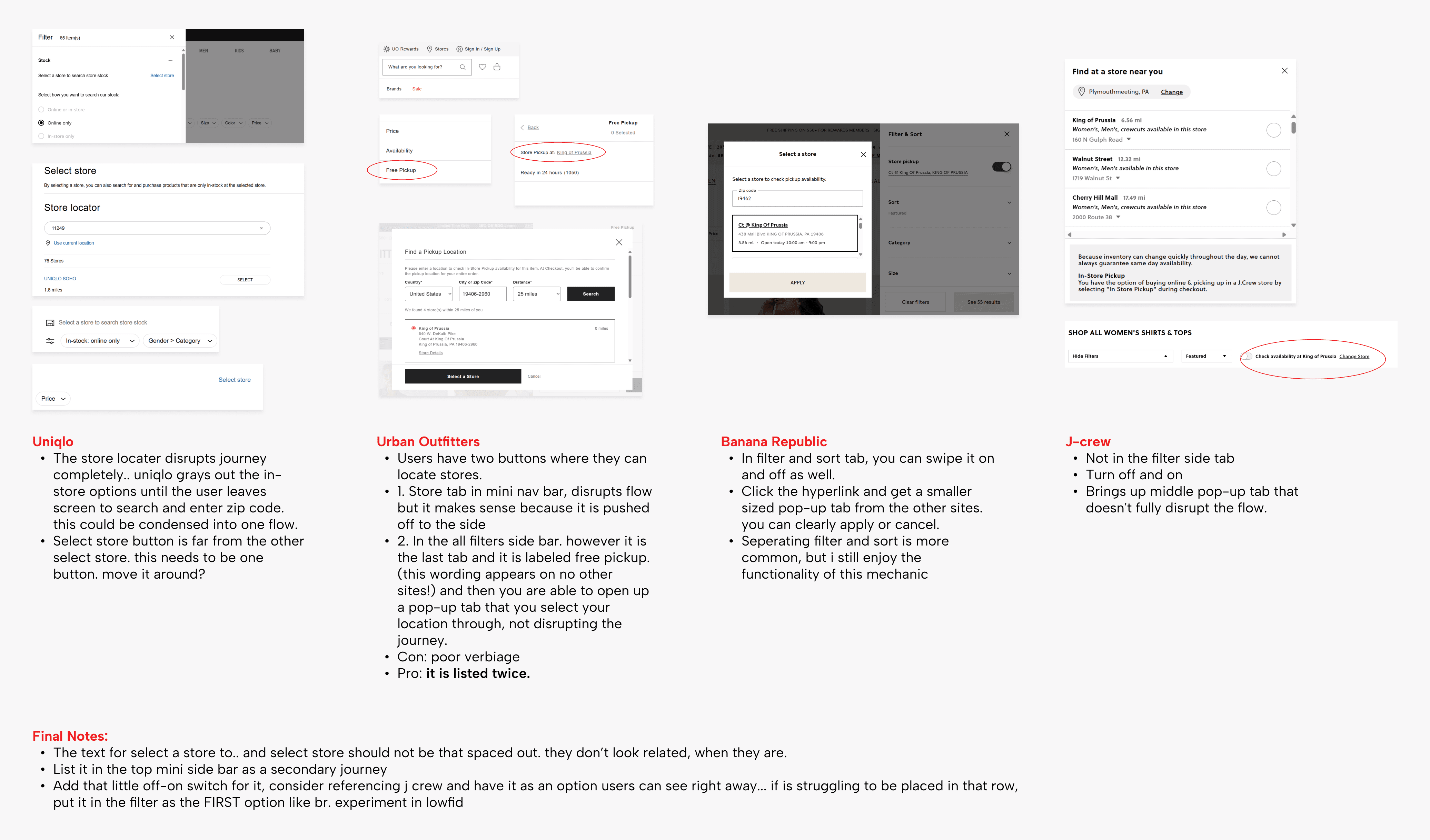
Below are the comparison annotations for 3/8 cases: Filter Sizing, Filter Color, & Location Finder.
Filter Sizing ↴
Filter Color ↴
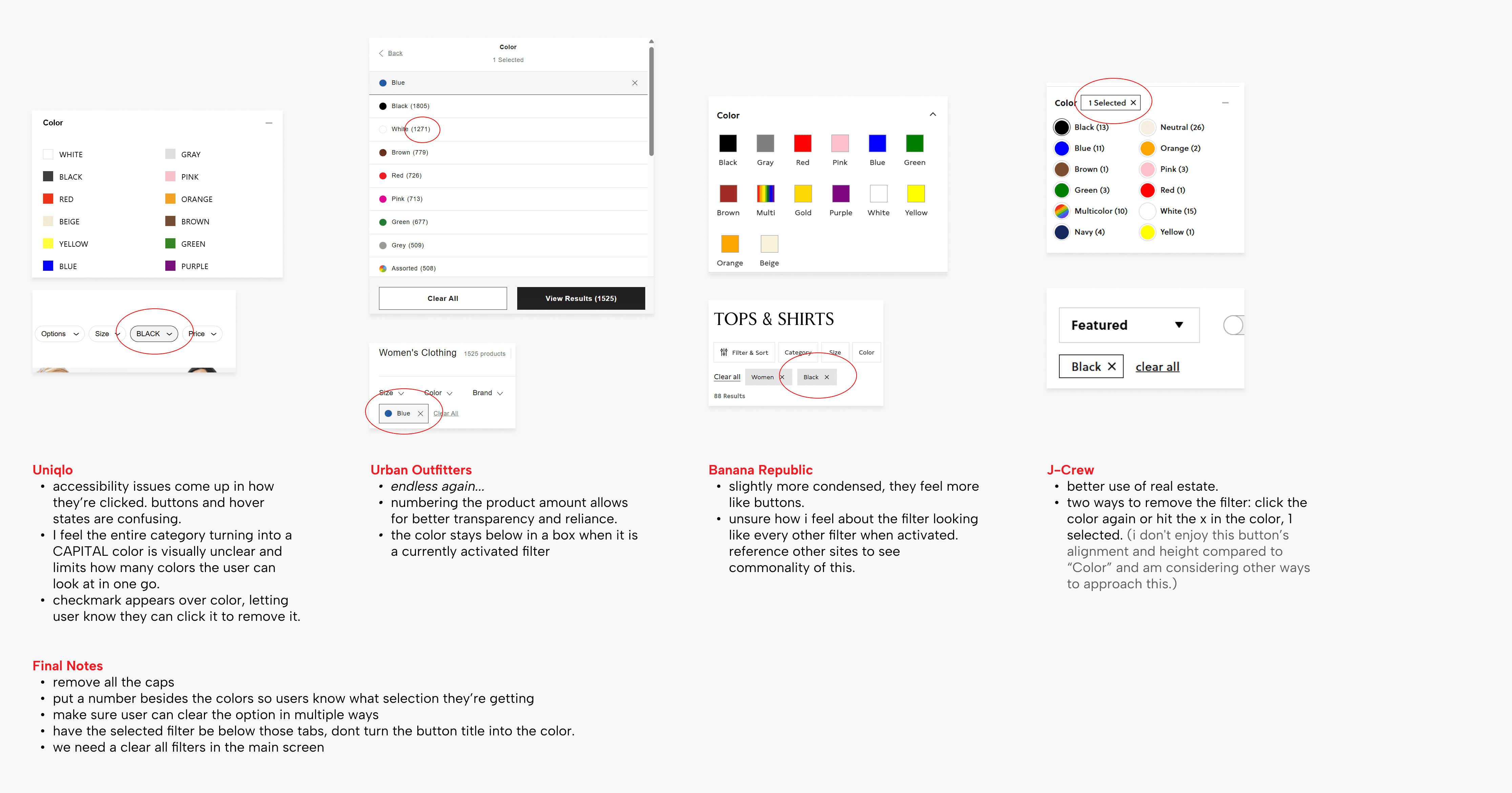
Location Finder ↴
Key Opportunities
Once I solidified the two main focuses, I conducted 2 in-depth audits.
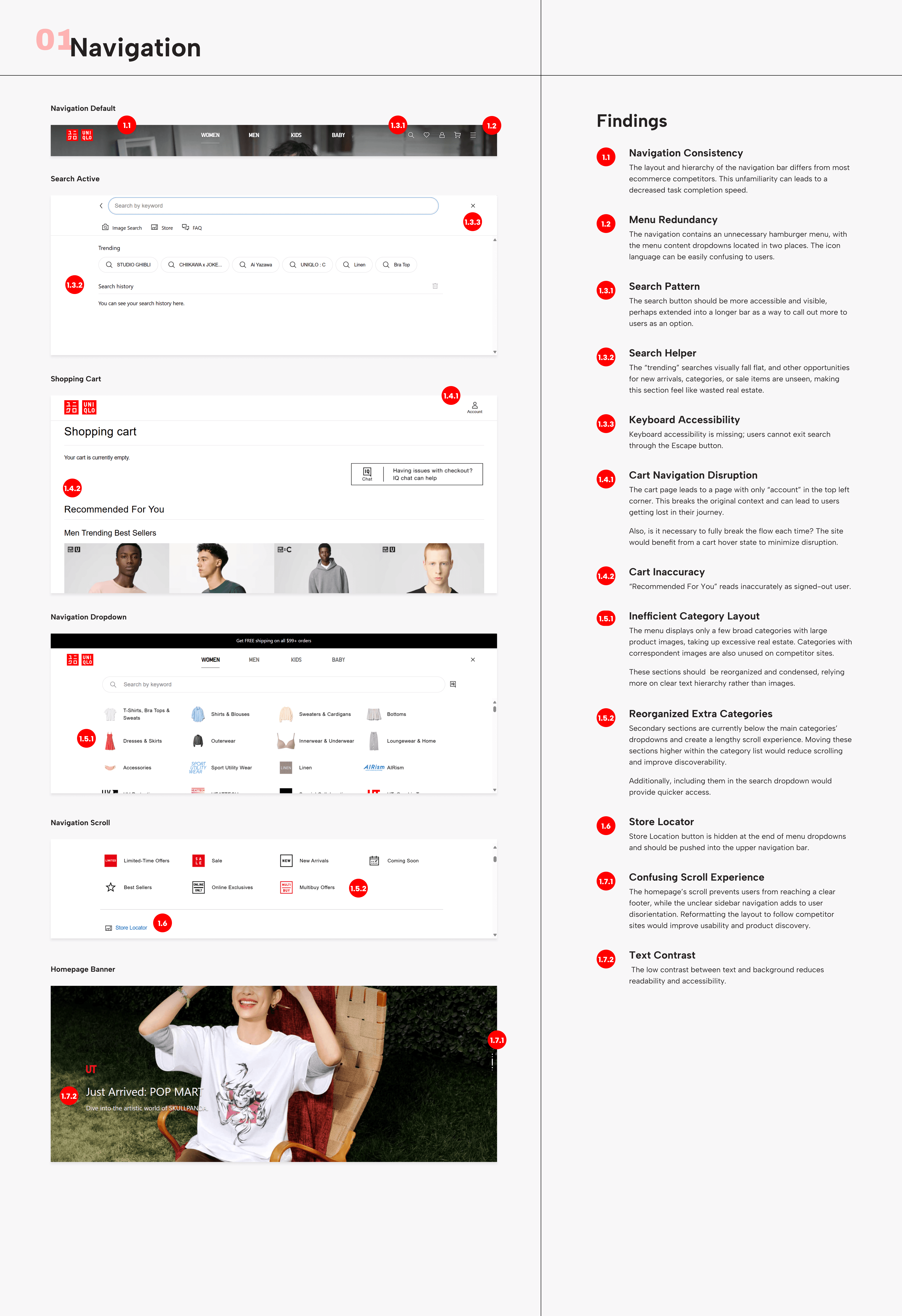
UX Audit
Navigation & Search Experience
This audit goes through the initial homepage, navigation bar/dropdown, and search bar features.
UX Audit
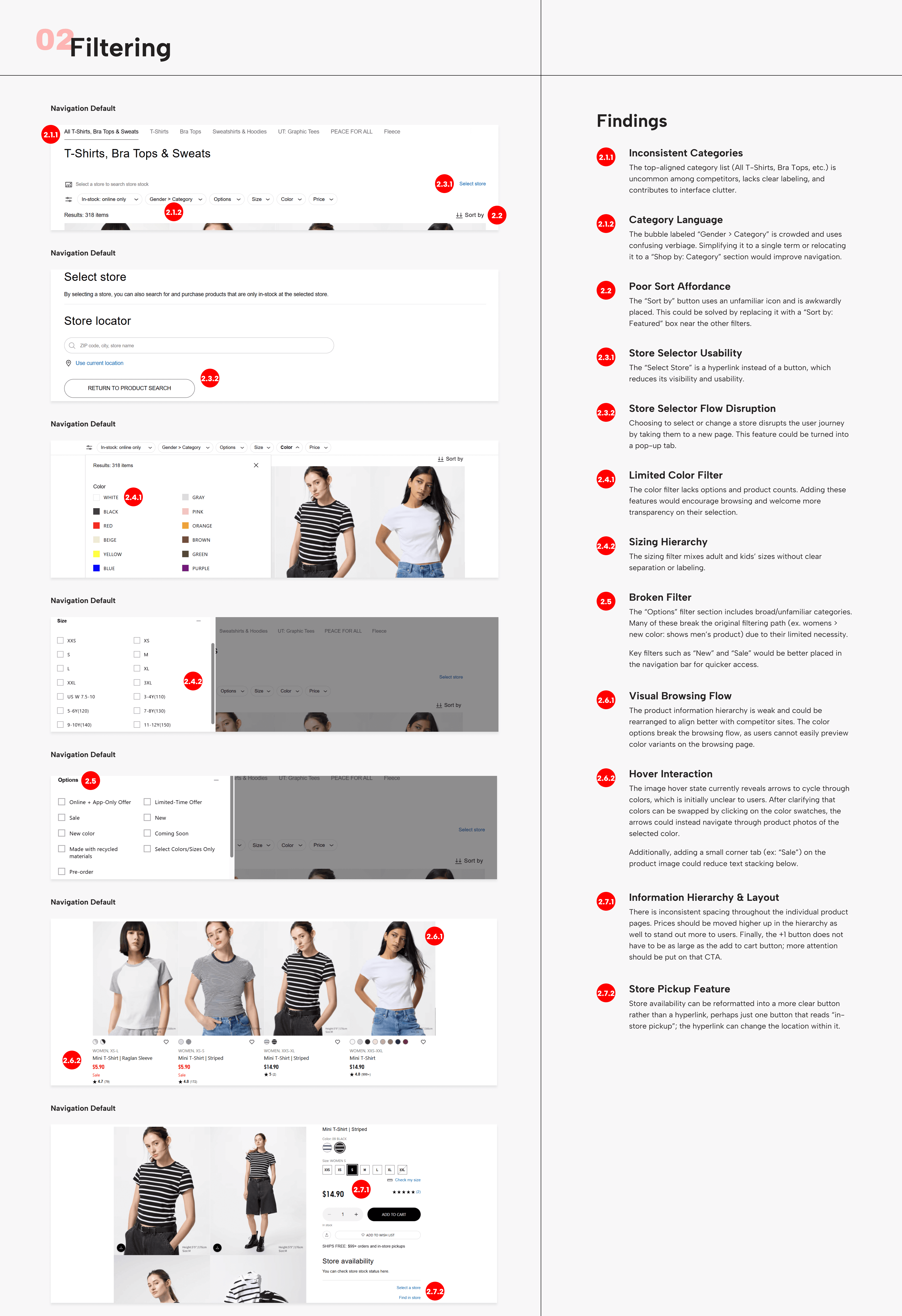
Product & Location Filtering Experience
This audit goes through the initial homepage, navigation bar/dropdown, and search bar features.
User Flows
The casual browser's goal is to make it from the homepage to a product page that suits their sense of style.
The intentional browser's goal is to check local in-store availability for a product they want, in the correct size.
Guided Product Discovery Through Navigation & Filters
New, Casual Browser
This flow addresses new users unfamiliar with Uniqlo’s brand and site who want to casually browse for basic pieces in their style.
Product Details Lookup & Store Availability
Experienced, Intentional Browser
This flow addresses returning users who want to check local availability for a specific product.
Mid-Fidelity Wireframes
Developed features that resembled high-performing competitor experiences while remaining consistent with best practices and brand guidelines.
Guided Product Discovery Through Navigation & Filters
New, Casual Browser
Product Details Lookup & Store Availability
Experienced, Intentional Browser
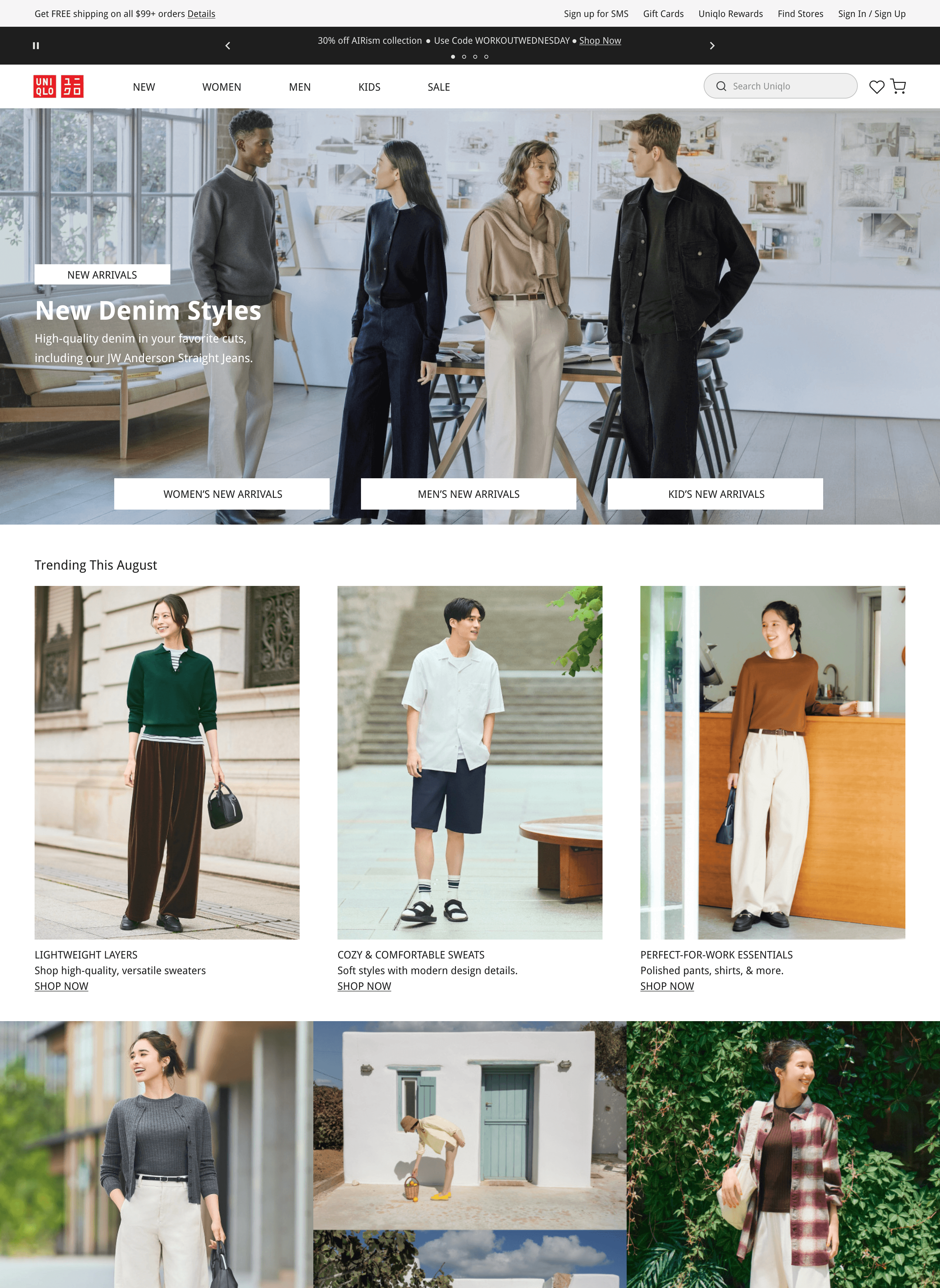
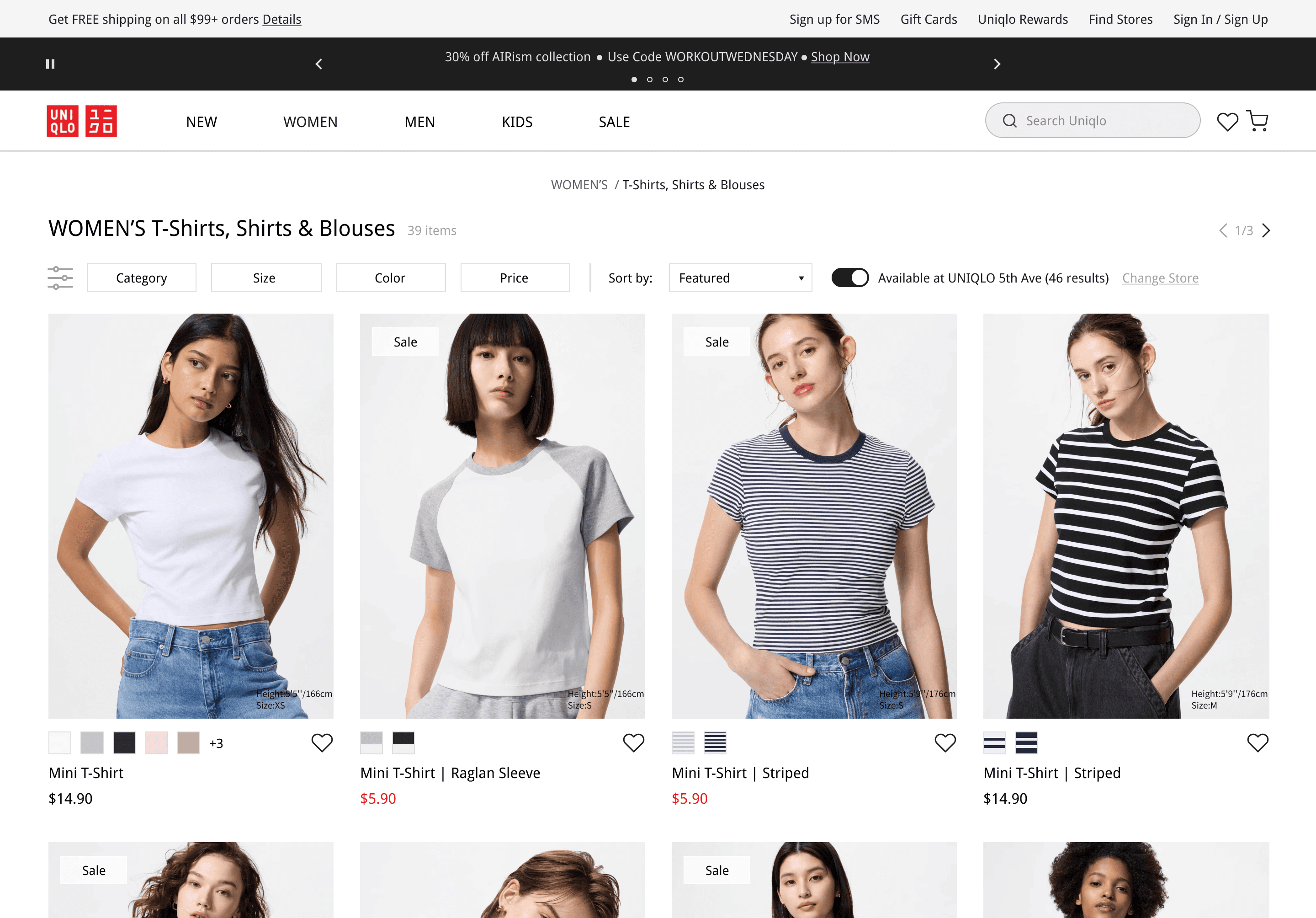
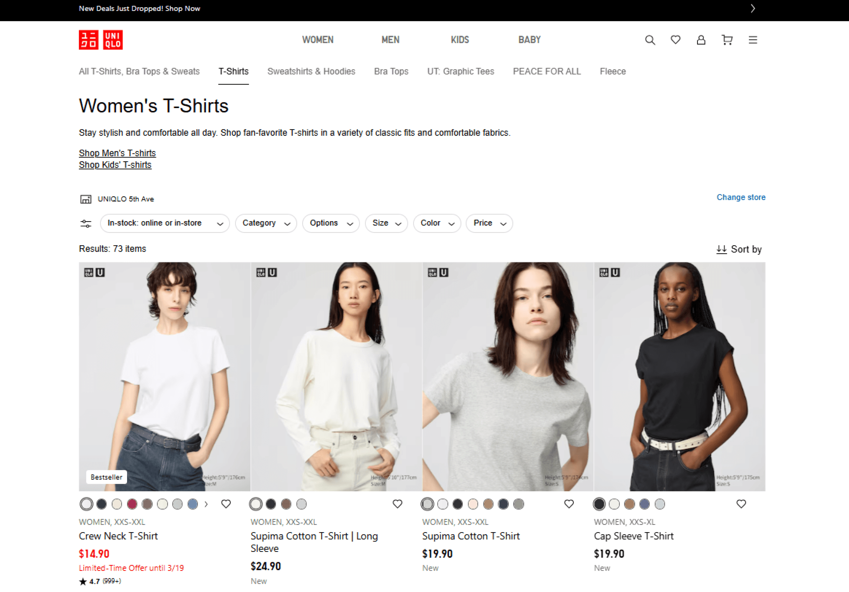
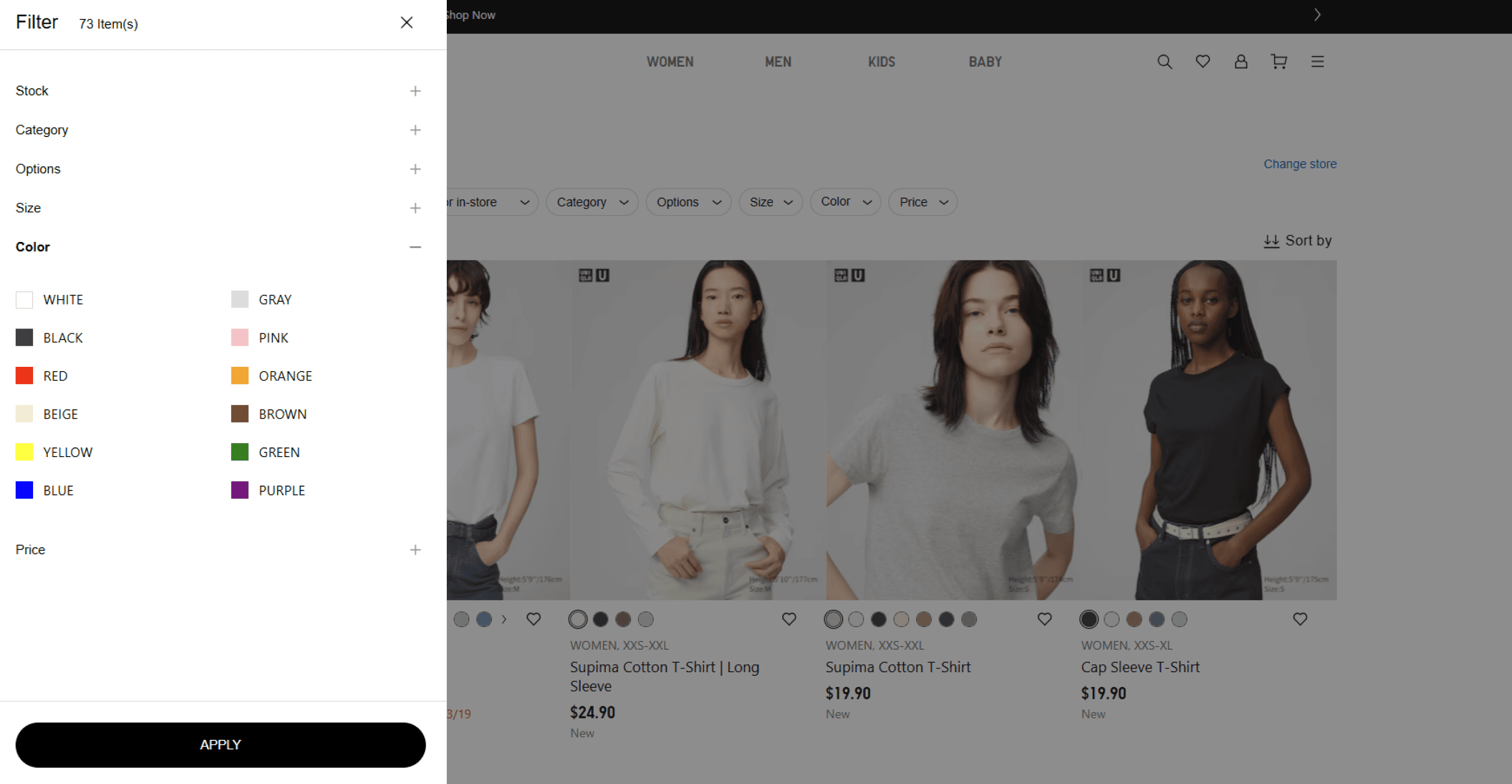
New vs Old Designs
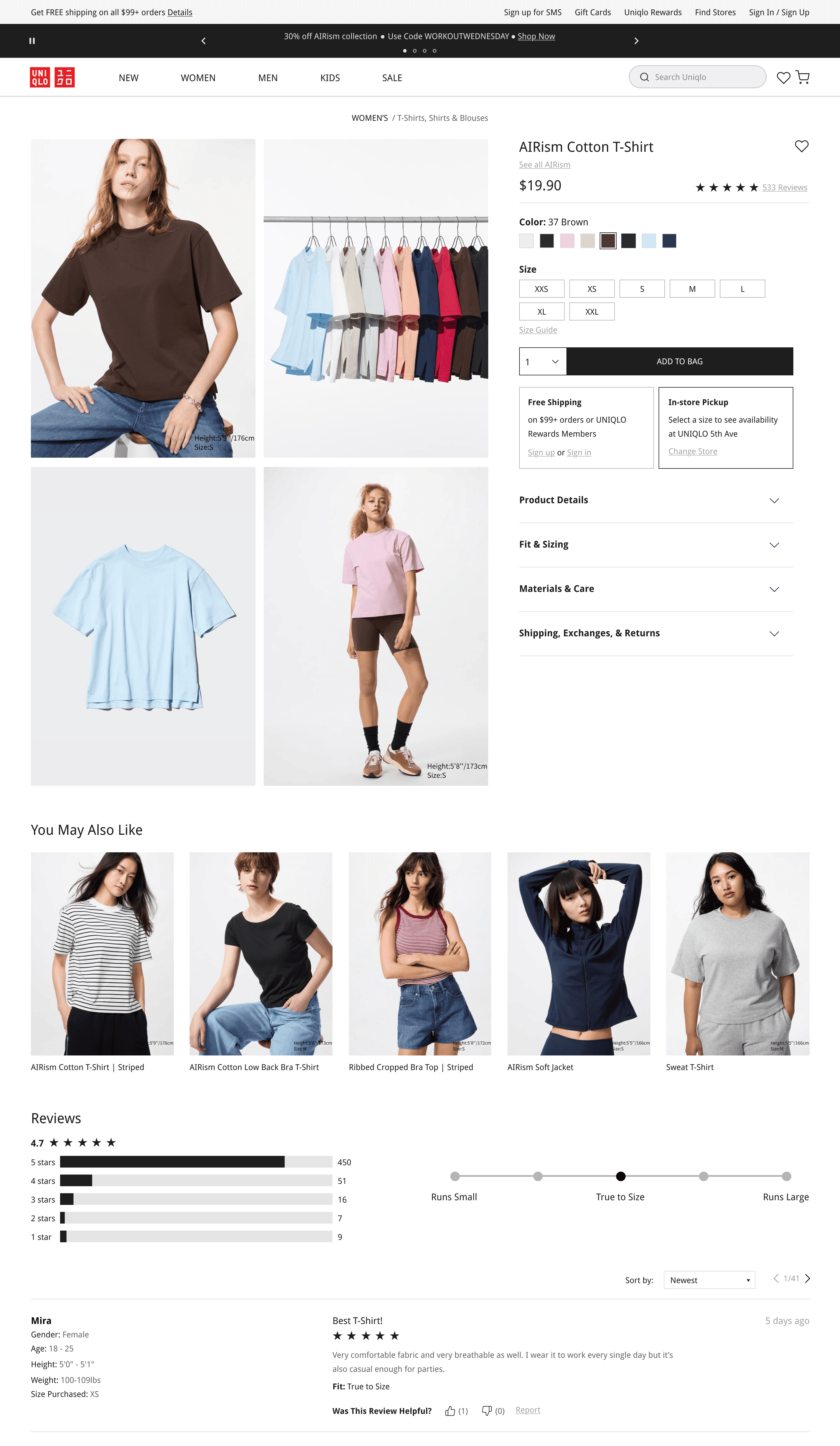
Homepage
Updated Visual Hierarchy
Rather than an infinite scroll of product images, the homepage is newly designed to reflect an editorial style; alternating between different product displays and navigations.
Improving Accessibility
Previously, white text with a drop shadow was used on top of images. Depending on the contrast of the image, text did not reach accessibility best practices. The redesign allows for text to alternate between on or below an image.
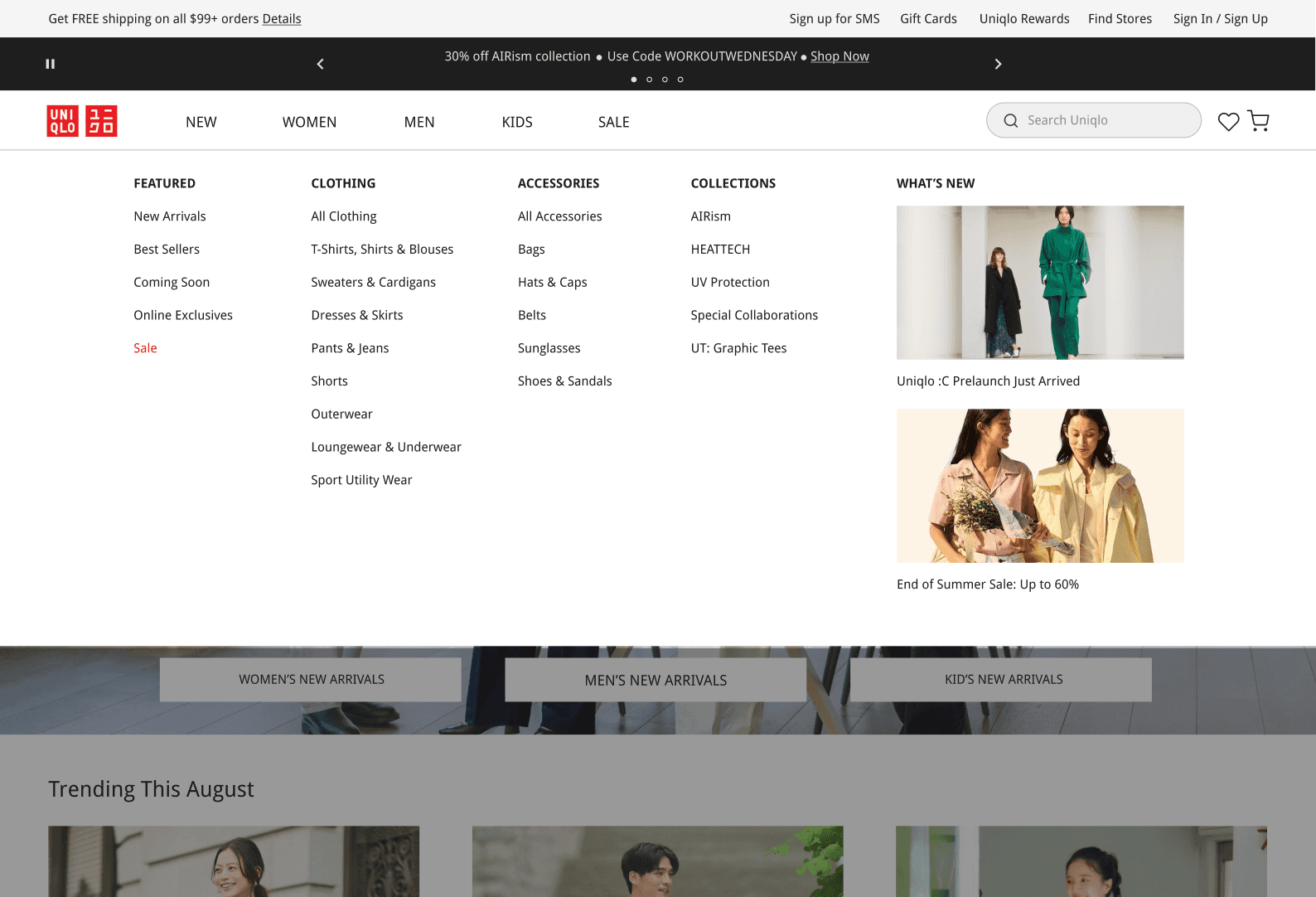
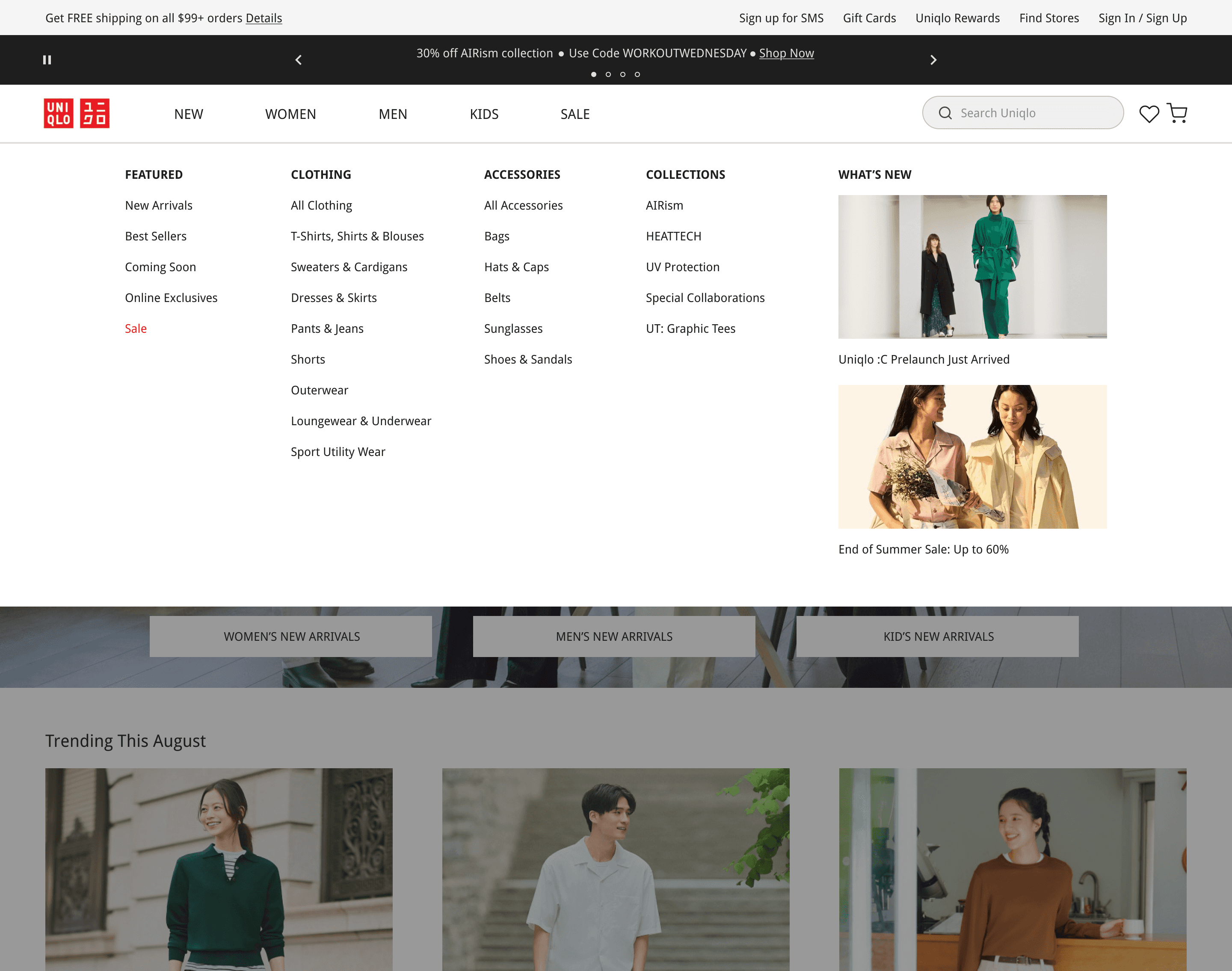
Navigation Dropdown
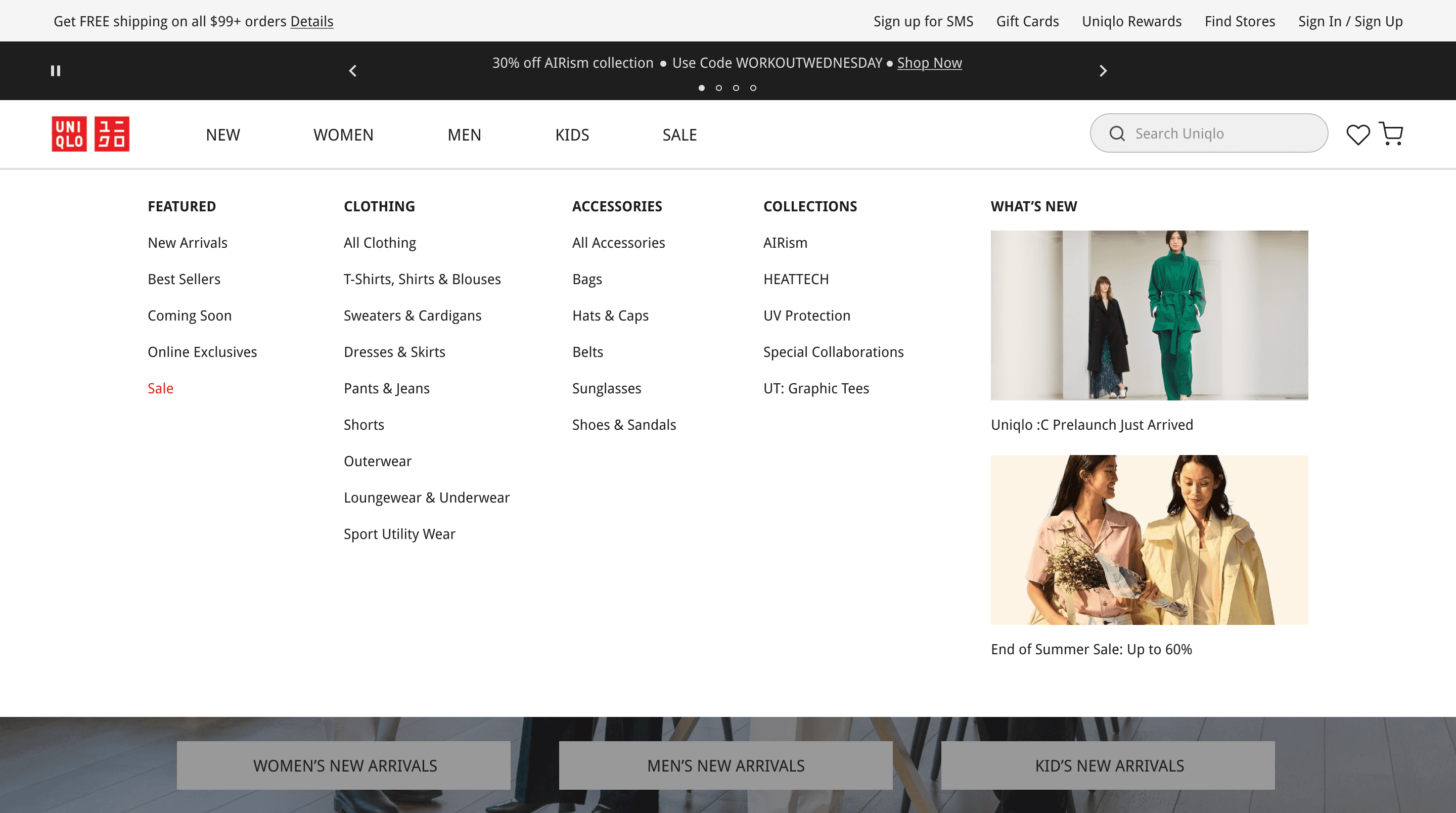
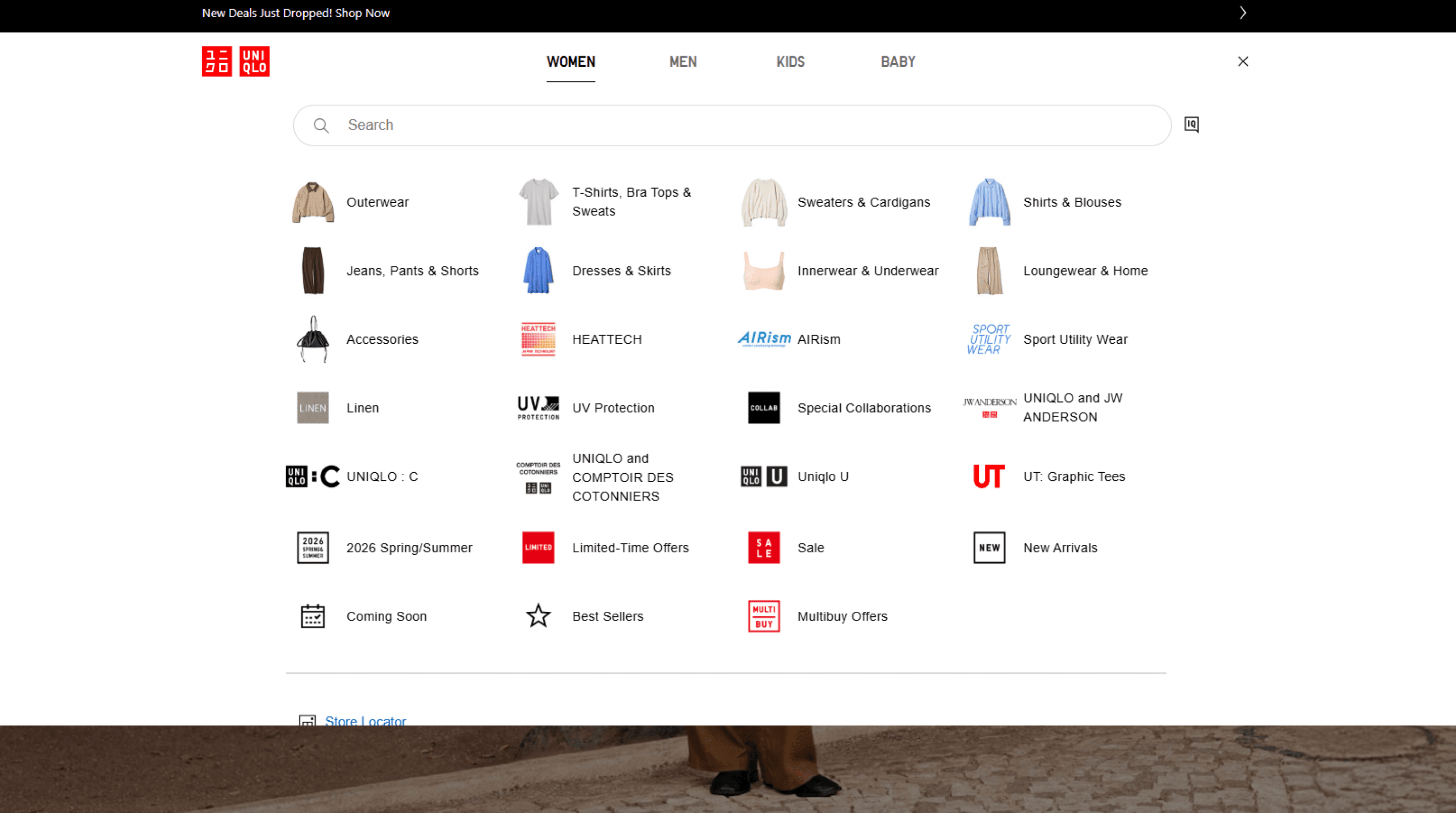
Improved Information Architecture
Images were removed and product categories were reorganized into 4 separate categories for quicker navigation.
Familiar Verbiage
The language in Uniqlo's original site as verbiage that is unfamiliar to users, leading to a more limited exploration. The new navigation uses words commonly seen on competitor sites,
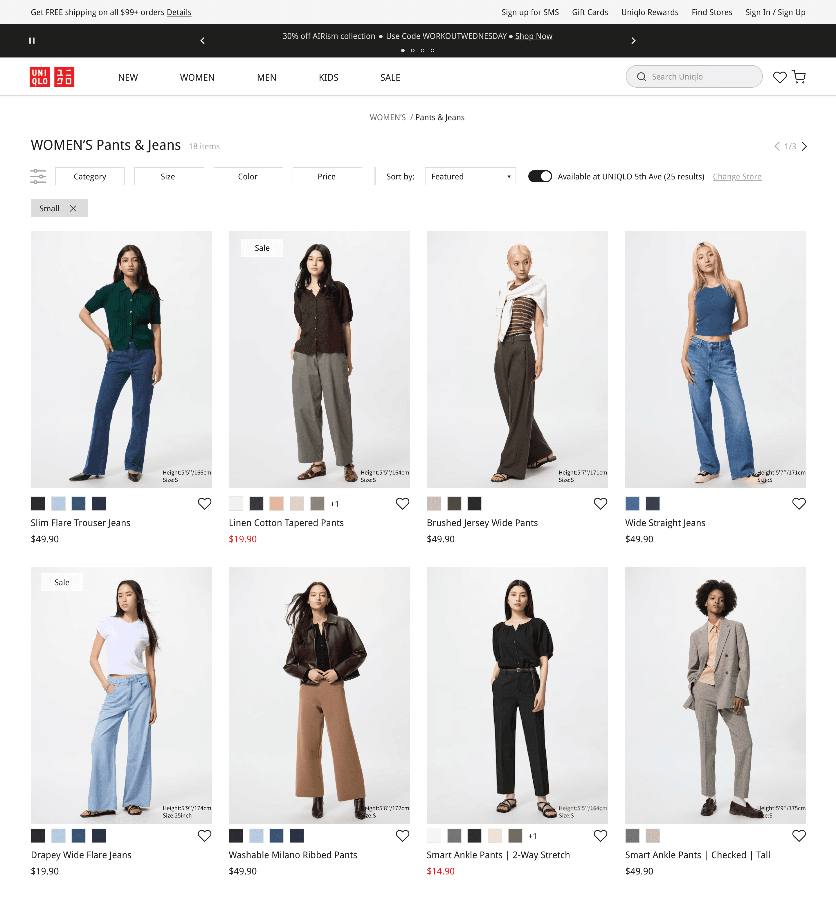
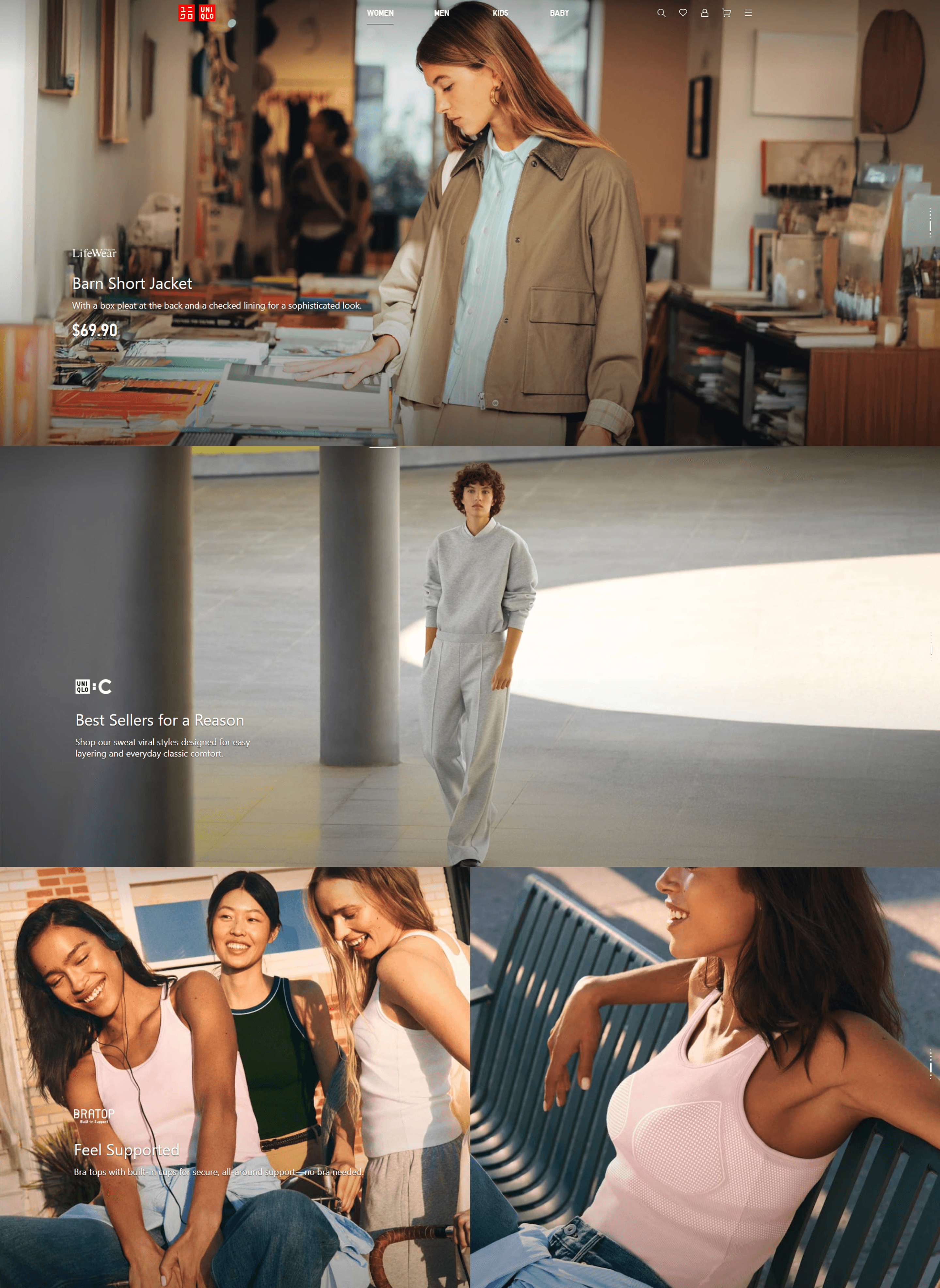
Product Selection
Improved Visual Hierarchy
Similar to the homepage, product images were visually designed to feel more spacious and clear. Informational text is also stacked to visually please user's eyes and lead to faster selections.
Filter Side Bar (Color)
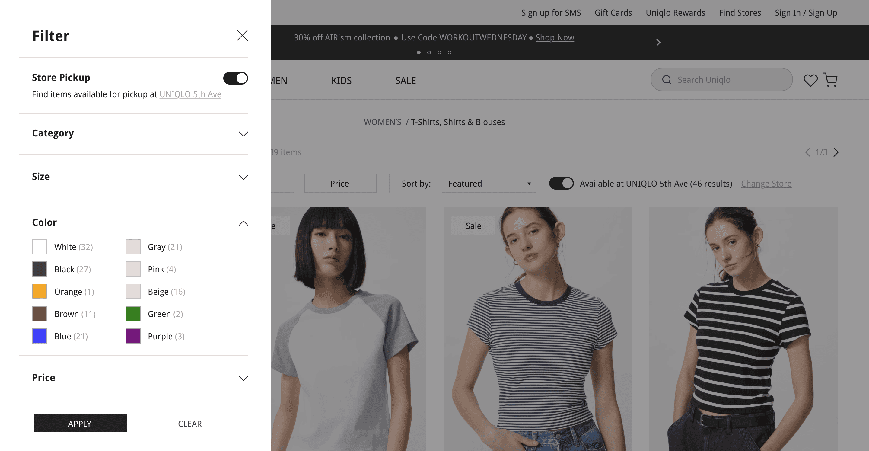
Filter Optimization
Improved product discovery by clarifying filter options and increasing transparency on the number of items that fit the user's filter selection.
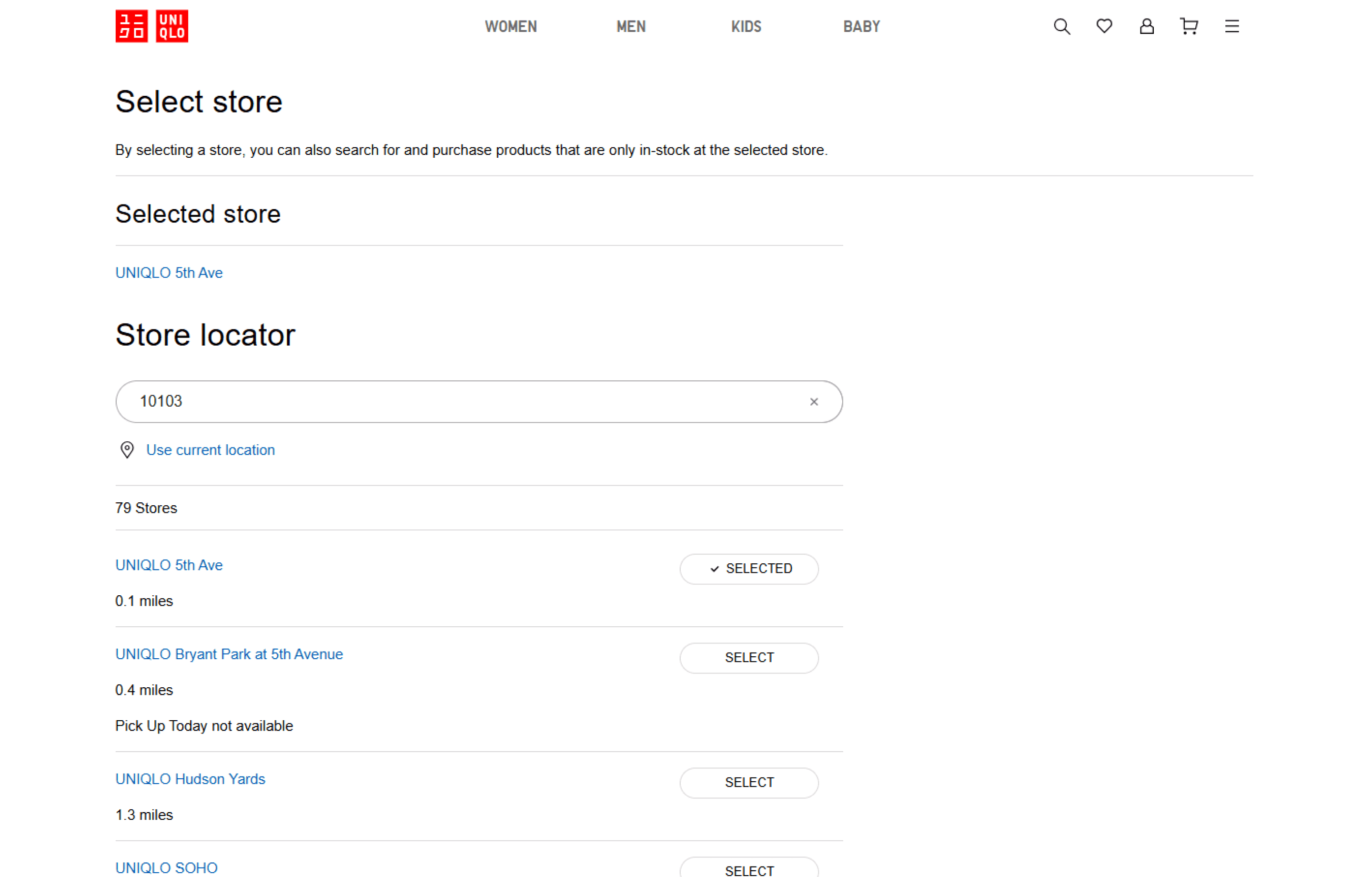
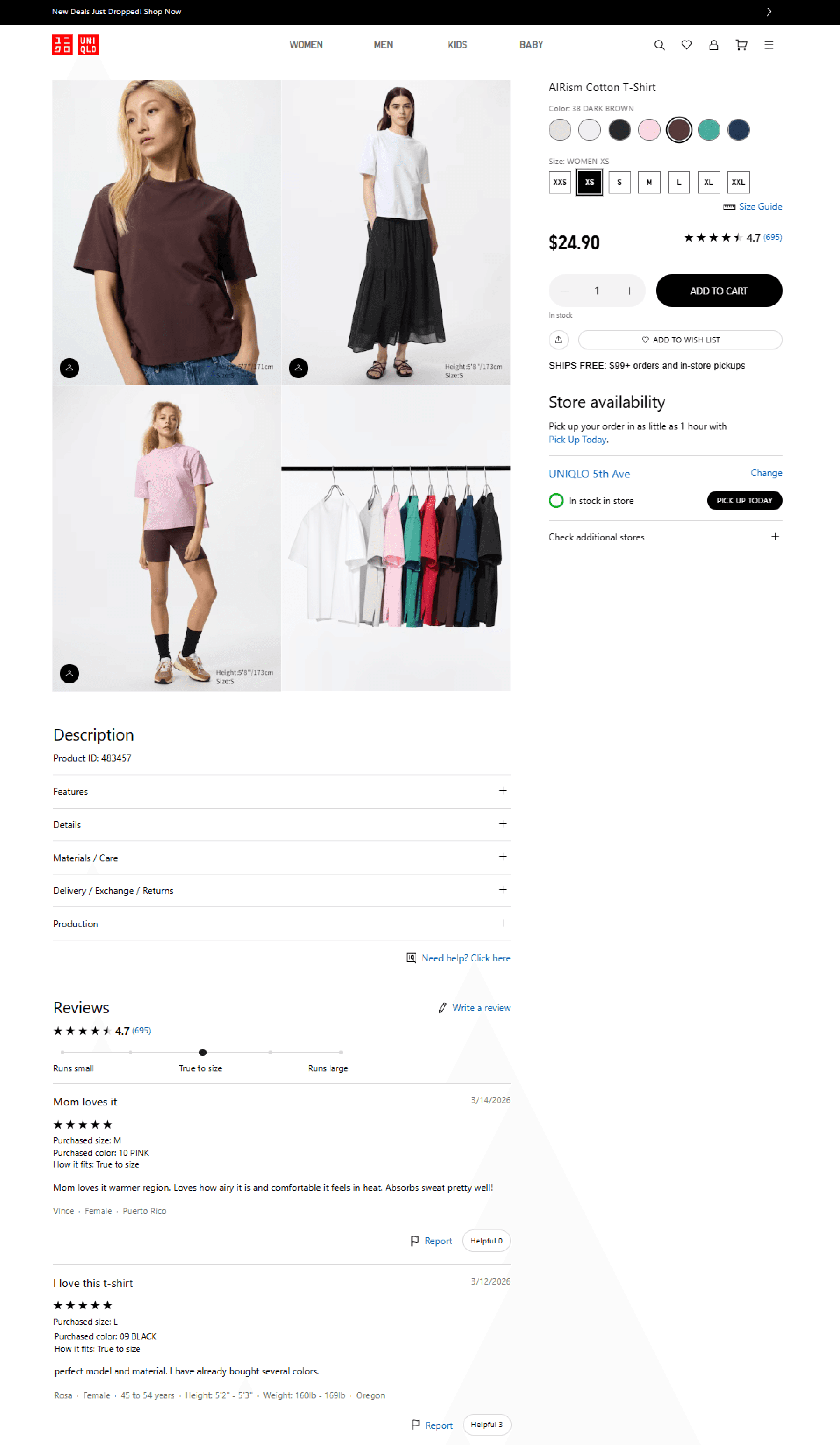
Store Location
Non-Disruptive Experience
Initially, checking a store location took the user out of their browsing journey and into a separate screen. I integrated an in-flow store locator experience that allows users to check nearby availability without leaving their browsing journey.

Filter Side Bar (Color)
Improved Information Architecture
Images were removed and product categories were reorganized into 4 separate categories for quicker navigation.
Familiar Verbiage
The language in Uniqlo's original site as verbiage that is unfamiliar to users, leading to a more limited exploration. The new navigation uses words commonly seen on competitor sites,
Final Takeaways
Auditing UNIQLO
Before I jumped into any UI design, I completed an in-depth audit of UNIQLO’s site, as well as a comparison sheet of its features compared to competitors. This process helped me identify usability issues and opportunities for improvement, while also recognizing industry standards and best practices.
Highlighting Navigation
UNIQLO’s biggest pain points are in its navigation, ranging from its dropdown function to product filters and discoverability. When approaching this redesign, I paid close attention to well-performing e-commerce competitors, as a point of familiarity for users. Features such as the nav dropdown were redesigned to address issues of length, clutter, and repetition. I tackled usability issues and eliminated extra scrolling, nested menus, and unclear hierarchies.
Visual Design
My goal was to modernize UNIQLO’s website while maintaining brand identity and strengthening its visual hierarchy. I aimed to design a cleaner experience that highlights products without overwhelming or confusing the user.
Reflection
As an avid UNIQLO shopper (literally my favorite store to shop for basics •ᴗ• ), I was excited to approach this website redesign. Their website was functional, but even before this project, I would constantly note areas for improvement in the back of my mind. I wanted this project to have an emphasis on analysis, both of competitors and e-commerce standards. In the end, most of the work in this redesign went towards improving the experience, as designing the interface came more easily to me with all the information I gathered.
As a result, the redesign reflects not only a visually refined interface but also a thoughtful, research-driven process that demonstrates my ability to translate insights into clear, user-centered solutions.