


END-TO-END MOBILE APP
Vitalize
Overview
Role
UI/UX Designer
Timeframe
5 weeks
Tools
Figma
Illustrator
Google Forms
Problem Statement
Competitor Research
I began my research by searching for competitors that were vital tracking apps and daily habit/emotion tracking apps. I landed on two highly rated competitors in each category: Visible & How We Feel.


SWOT Analysis
My insights and findings were summarized into a SWOT Analysis, where I discovered their shared strength of bringing in daily active users, but opposite pain points of having too much or not enough data to concisely highlight health trends.
Key Insight
Despite contrasting approaches, with Visible being more complex & data focused and How We Feel being overly simplified and human-centered, both apps share the same core UX challenge of designing for long-term user retention.
Problem Statement
From this research I derived a problem statement to guide the next phase of my project:
User Research
I surveyed a total of 9 people to gather information on what motivates them to take care of their health, their personal health history, and what they’d be interested in seeing in a health tracking app.


M & F, 18-34 years old
User Interviews
Surveyors were given the option to participate in a 5-10 minute interview at the end of the research survey. In these interviews, they were asked about their preferences in more detail.
“I want an app where I can quickly pick the symptoms that matter most to me and check them off each day in seconds so I can actually stick with it and not get overwhelmed.”
“I want something that helps me log my symptoms easily and actually see trends since it’s hard to tell what’s causing my energy to drop so much lately.”
“Apps like Apple Health show me a ton of data, which is nice, but I can’t really connect those numbers to how I actually feel day to day and figure out habits of mine I could change."
Key Insights I gained from user testing:


Check-in sketches ↴

User Flows

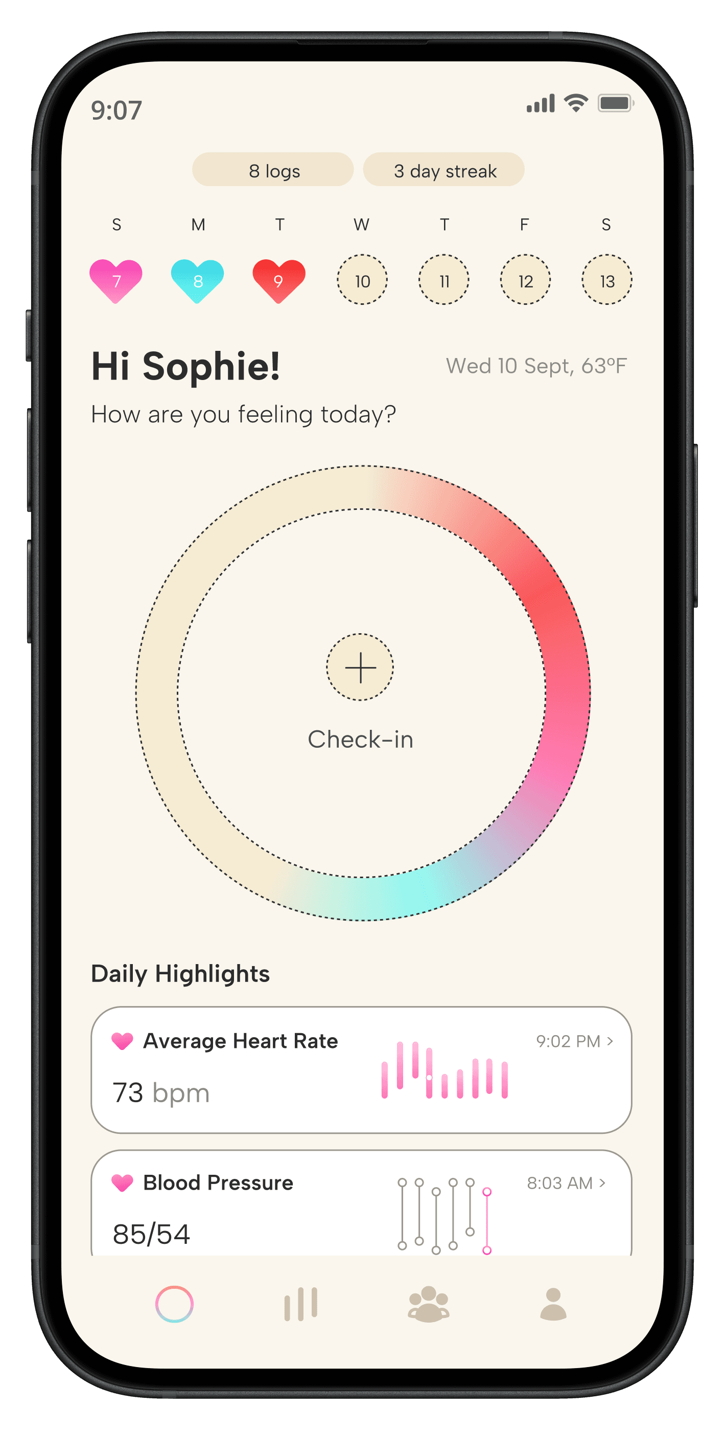
Daily Check-in
Sophie Fitzpatrick, “Proactive Patient”
This flow addresses Sophie’s pain point of lacking a structured way to check-in on her health by providing an organized experience to routinely log symptoms and daily habit.

Browsing Health Data
Kate Rivera, “Pattern Seeker”
This flow addresses Kate’s struggle of becoming overwhelmed by too much health data by designing a clear informational experience that highlights important vitals and symptoms.


Onboarding Flow ⤴
Mid-Fidelity Wireframes
Developed intentional onboarding features that targeted both user persona's pain points.
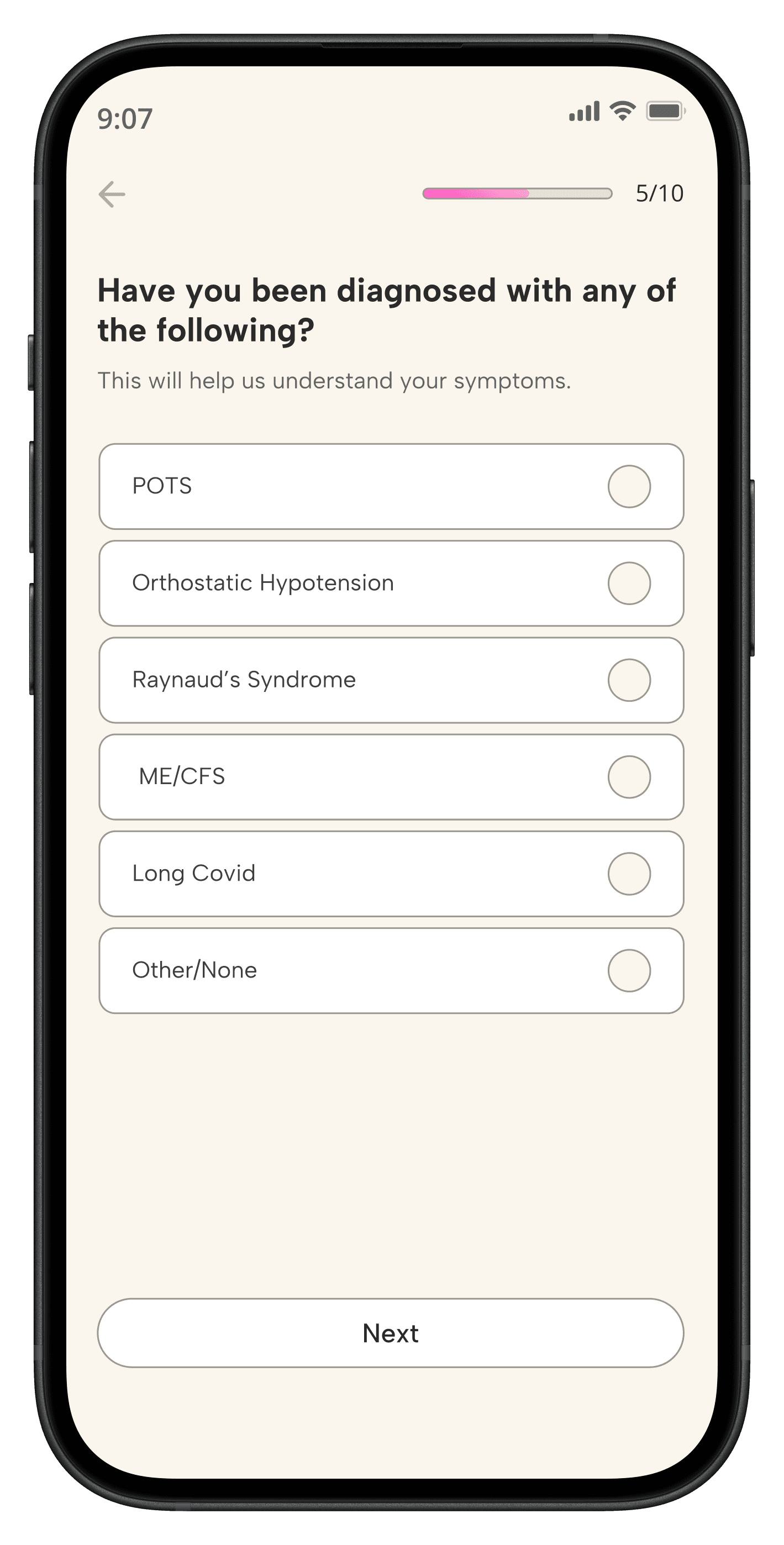
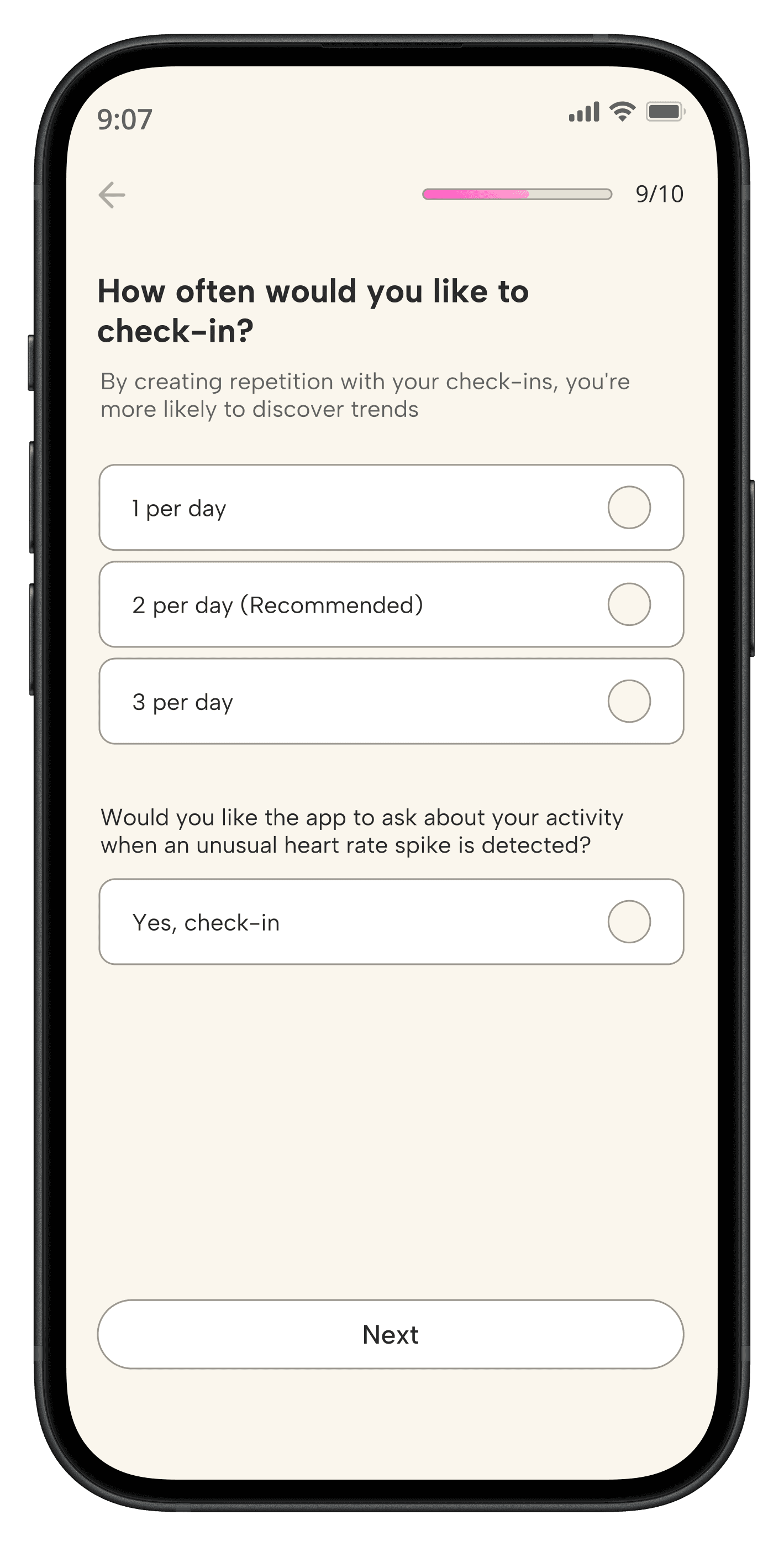
Onboarding & Health Assessment
Sophie Fitzpatrick, “Proactive Patient”
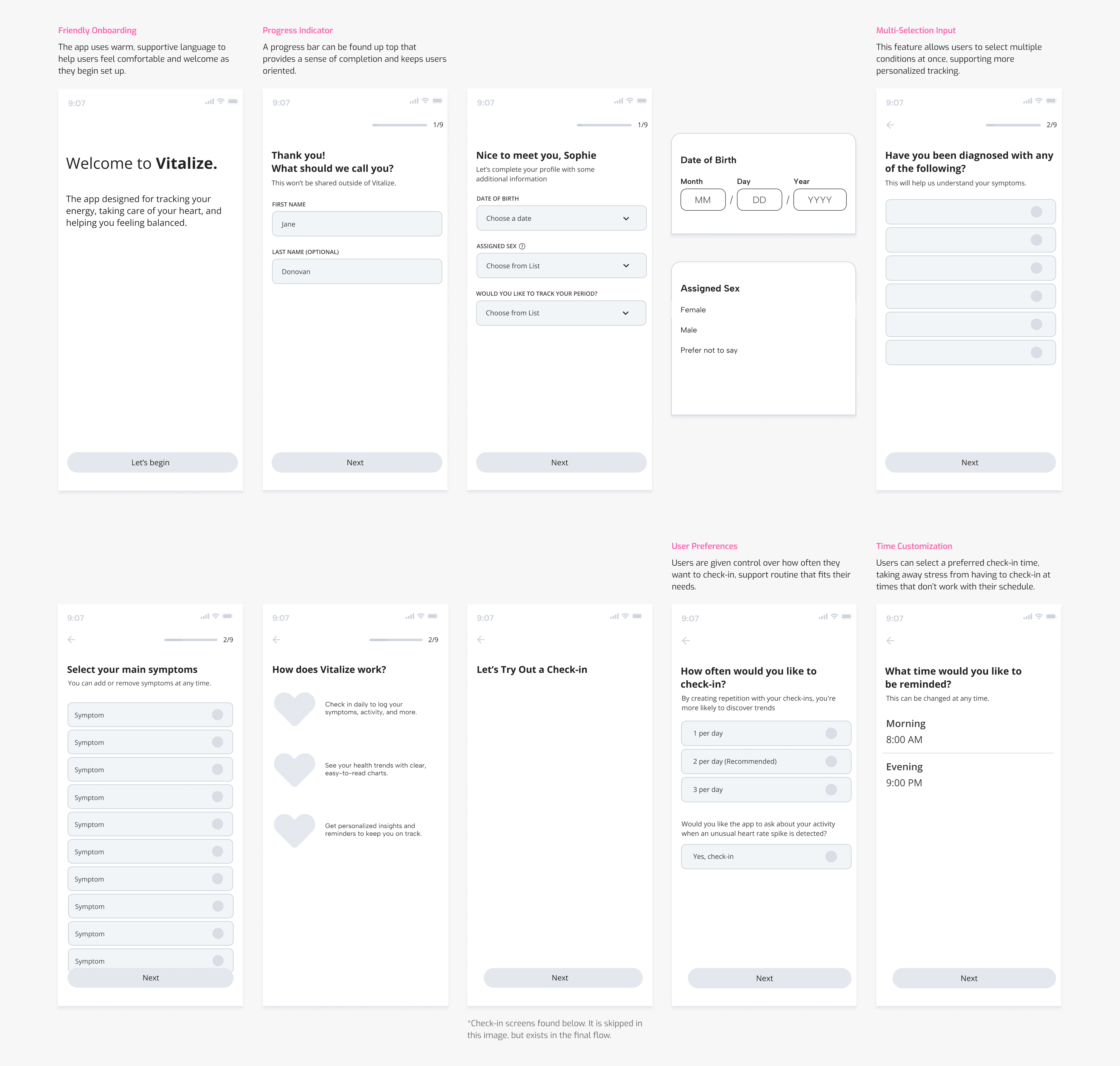
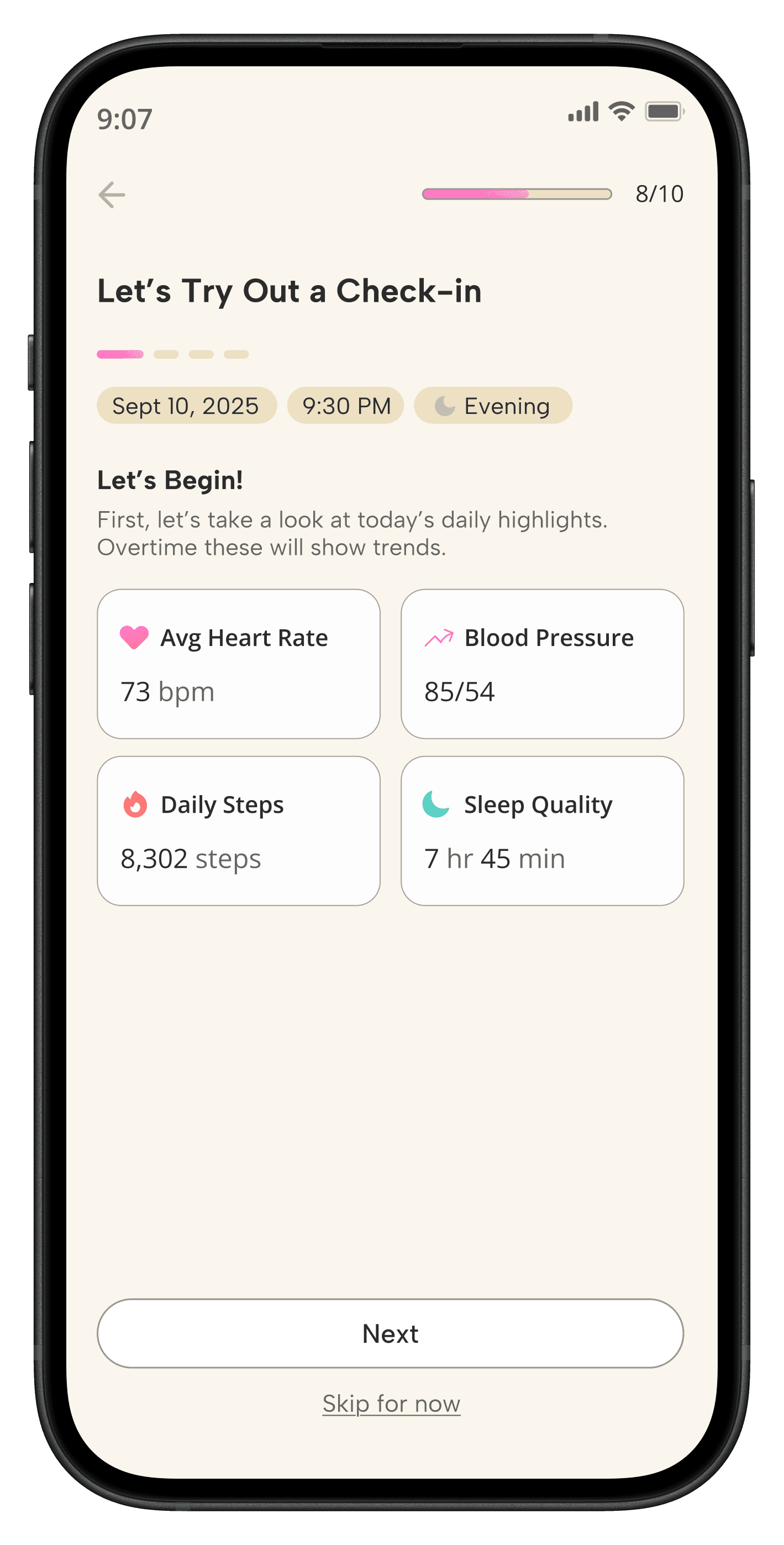
I then developed the daily-check in as how it would be found in the onboarding tutorial.
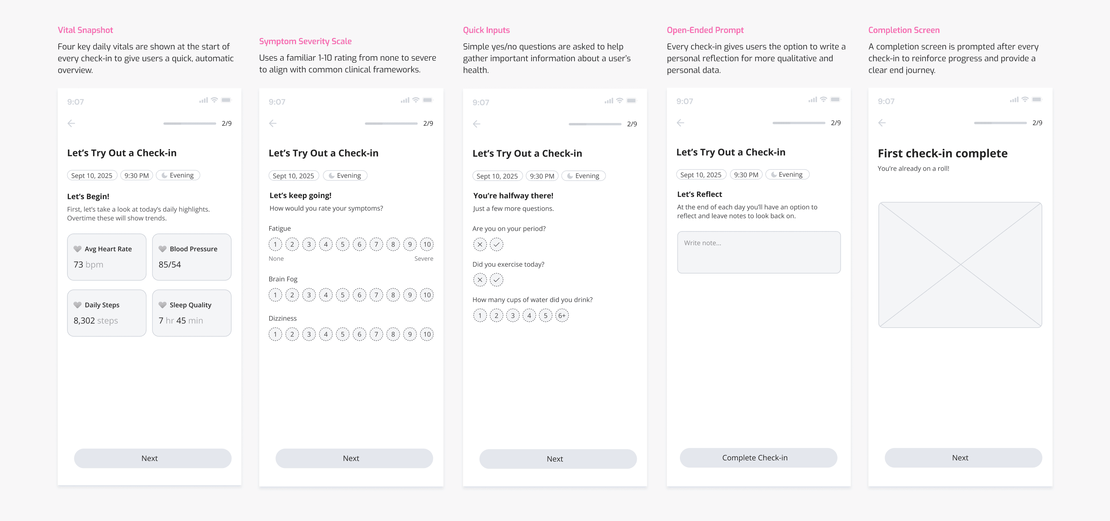
For a returning user, "Let's Try Out a Check-in would become "Checking-in" ↴
Daily Check-in
Sophie Fitzpatrick, “Proactive Patient”
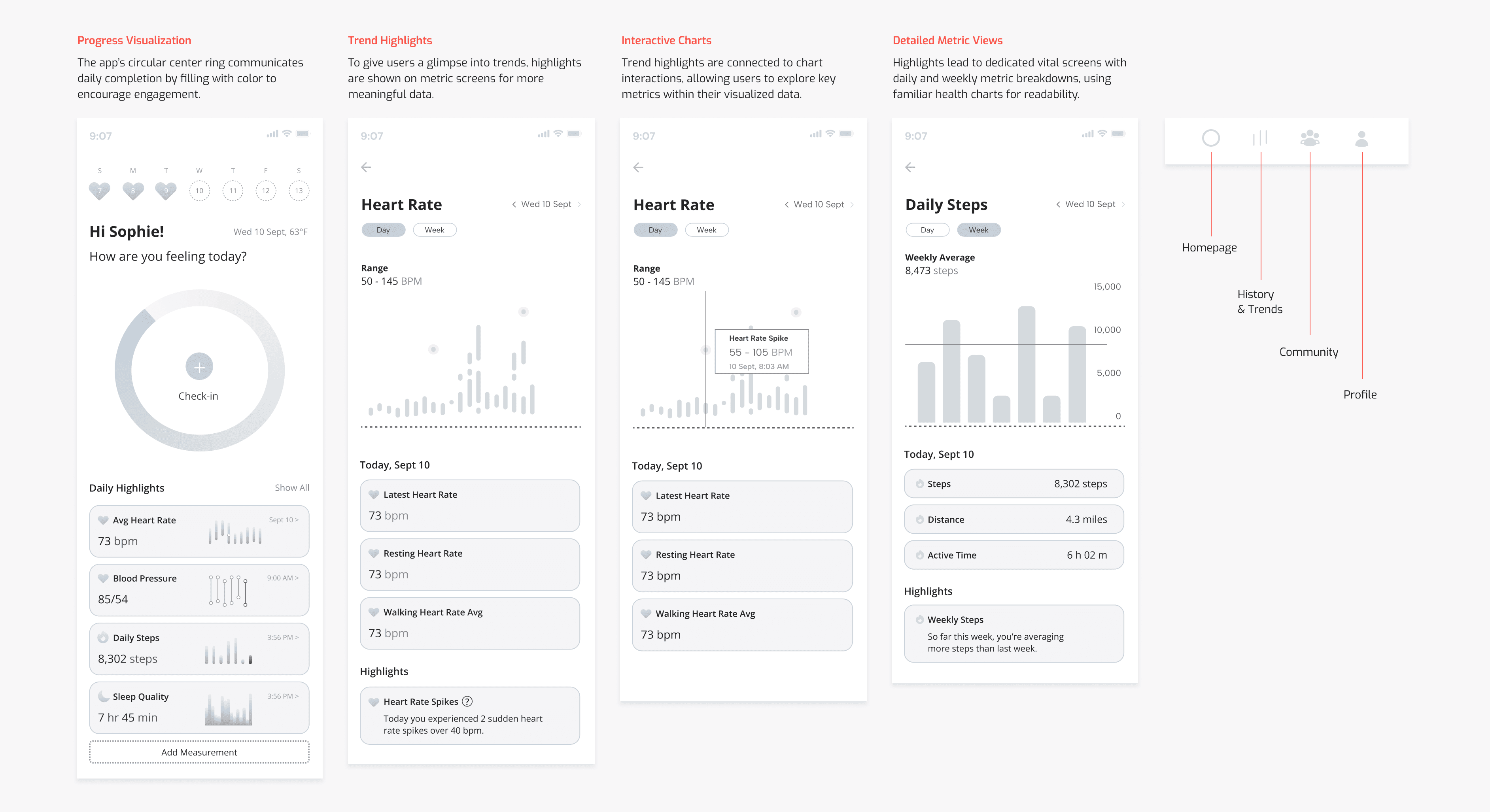
Browsing Health Data
Kate Rivera, “Pattern Seeker”
Visual Design
Usability Testing
I conducted 1 round of usability testing with 5 testers. Each user went through medium-fidelity journeys designed to be based off the flow charts above. All 5/5 users were able to successfully onboard, check-in, and review trends.
However, significant changes were made in each flow to give more control to the users and clarify the steps and duration of processes within the app.
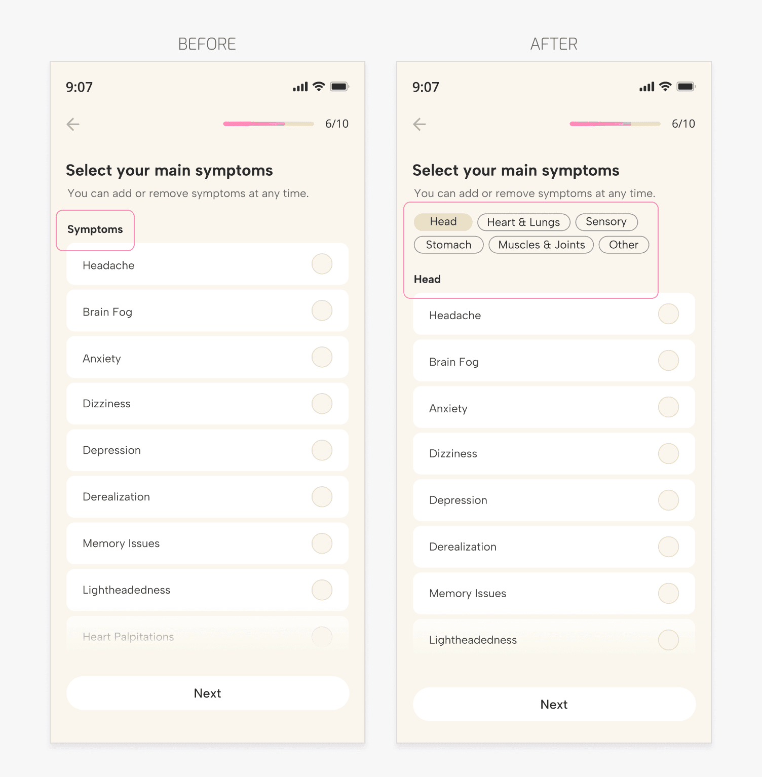
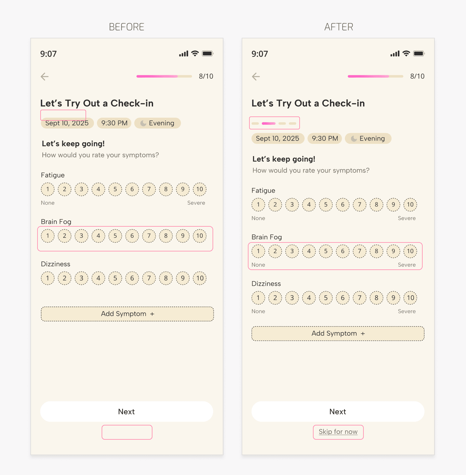
Onboarding: Improving Information Architecture
Problem: Lack of Symptom Filtering
Users wanted the ability to filter through symptom categories. Without this feature, they felt they had to keep scrolling.
Solution: Categorized Filters
Filtering options were added, allowing users to browse and select relevant symptoms. This change helped users clearly see what the app included without unnecessary scrolling.
*Adding these categories helped with addressing Sophie’s pain point of feeling overwhelmed during health app onboarding.
Onboarding: Adding Flexibility
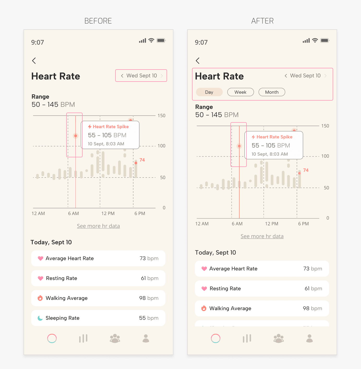
Browsing: Clearer Information
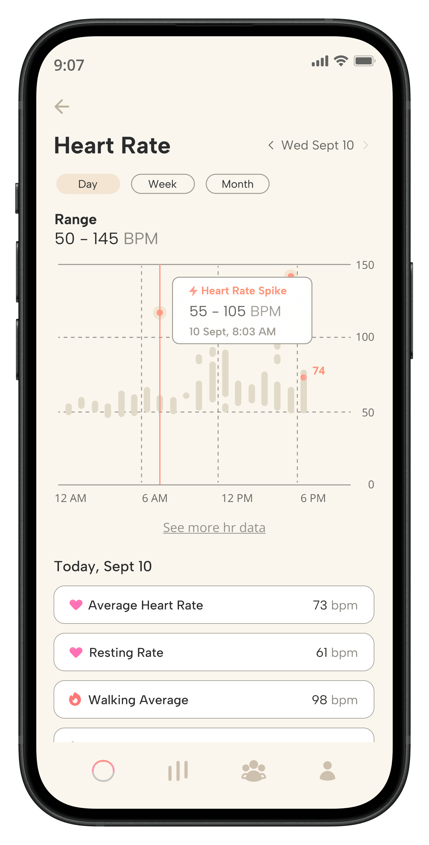
Problem: Limited Data Visibility
On the data pages, such as the heart rate page, users wanted to review more than a single day’s (or week’s) metrics at a time.
Users wanted a less alarming color, they felt a red-based orange expressed urgency.
Solution: Expanded Data Options
Additional timeframes were introduced, allowing users to switch between daily, weekly, and monthly trends. This gave users a clearer picture of their overall patterns.
The chart color was shifted towards orange.
*Incorporating an organized but large vital history database helped address Sophie’s need to be able to locate all her information in one location.
Final Designs
Welcoming Onboarding
The final onboarding screens are designed to feel both welcoming and comforting
Progress bars and skip buttons are included to reduce pressure
Subtext is utilized to speak the user through the process
Check-In Centered
An optional check-in sample is displayed to users in the onboarding so they understand the overall experience.
The homepage is centered around the check-in feature, also highlighting daily vitals with constant updating
Simple & Familiar
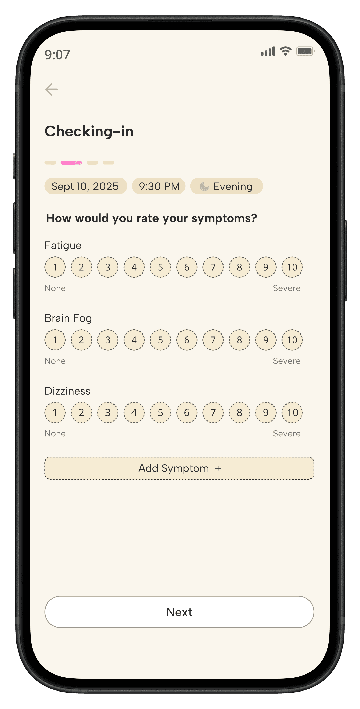
Symptom questions reflect real-world health assessments
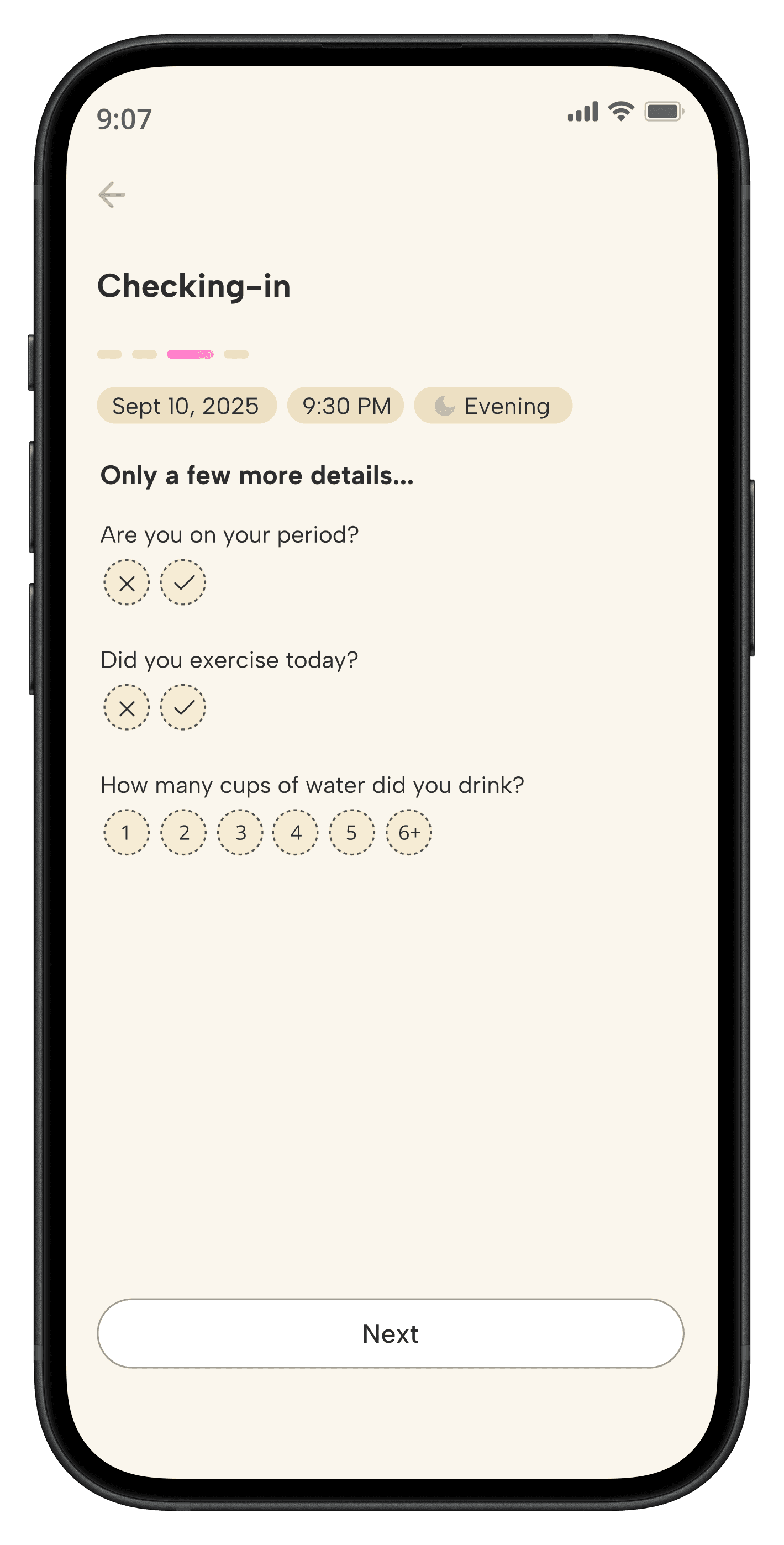
Important, but simple, questions are asked about the user’s habits

Interactive Data
Vitals reflect familiar health charts and are designed to be easy to read
Charts contain interactive elements related to common blood pressure / health condition symptoms
Users can explore daily, weekly and monthly vital history from the homepage
Organized History
Previous check-in’s, health data past 1 year, and trend insights can be easily located through the nav bar
Hearts are used to show completion on a calendar and can be looked into
Users can source a full list of health data to go in and out of different vital history
Key Takeaways
Understanding Health Data
This app posed the challenge of clearly understanding dysautonomia disorders and their symptoms, as well as interpreting health data so it could be properly charted and displayed. A lot of research went into learning how data specific callouts (or outliers) can be pinpointed for users to easily comprehend.
Approachable Design
Initially, I approached this project with the idea of a very clean design, modeled after health diagnostic boards and charts. After reviewing examples and speaking with potential users, I began experimenting with a more friendly, “bubbly” design while still staying true to the standards of a health app.
Information Overload
My current struggles in this project fall under knowing what data to prioritize displaying. Keeping in mind that the range of knowledge a user has varies greatly, I’ve found some difficulty in knowing what users will expect or want to see.
Reflection
This project has been a pleasure to work on and allowed me to step more into more health-centered data, repetitive habits, and accessibility. Designing Vitalize pushed me to think more carefully about the emotional impact of an experience and how little shifts in language, data organization, and visual design can maintain or increase users and app retention.
With more time, I’d love to add more to the way trends are gathered by user data and displayed. As of now, I followed the technical limitations / normalcy of health app trend data, but I believe with more prototypes and user testing this can be expanded on.
Moving forward, I’m excited to continue exploring how thoughtful design can make health data feel both more approachable and digestible. Yay!